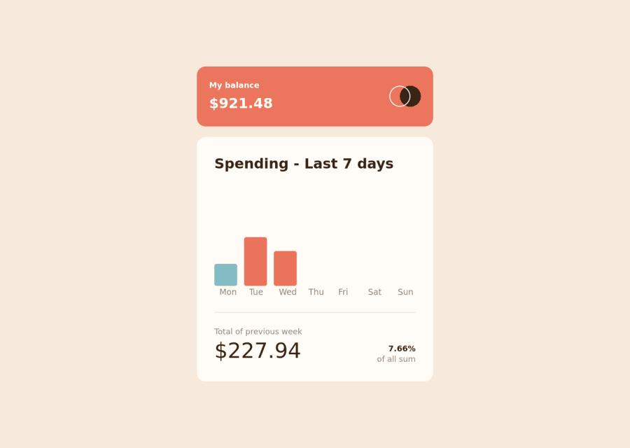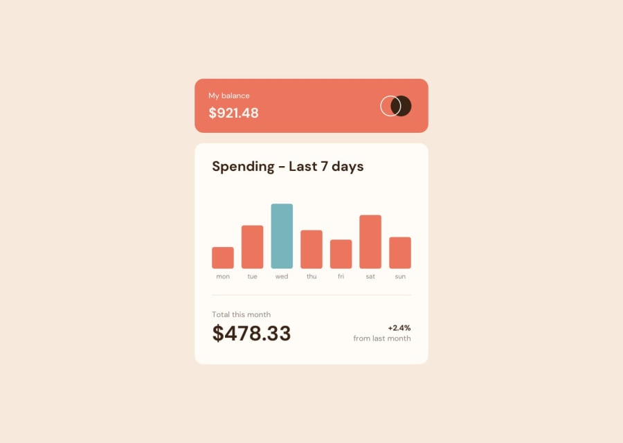
Design comparison
SolutionDesign
Community feedback
- @romila2003Posted about 2 years ago
Hi Ivan,
Congratulations 🎉 for completing this challenge, the chart looks great and is functional and responsive.
- It's great that you used the right semantics for the head and the chart container however I noticed that you nested the
maintag andfootertag within thesectiontag. This is not semantically correct therefore you have received errors regarding this.
Overall, great project and wish you the best for your future projects 👍.
0 - It's great that you used the right semantics for the head and the chart container however I noticed that you nested the
Please log in to post a comment
Log in with GitHubJoin our Discord community
Join thousands of Frontend Mentor community members taking the challenges, sharing resources, helping each other, and chatting about all things front-end!
Join our Discord
