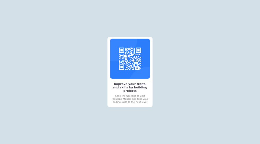
Design comparison
Solution retrospective
I welcome advice! Help me improve
I would like to try writing more responsive code. I have a bit of a problem with the size of the images.
Bye everyone, love you <3
Community feedback
- @correlucasPosted about 2 years ago
👾Hi @fedementre, congratulations on your solution!
Great solution and a great start! From what I saw you’re on the right track. I’ve few suggestions for you that you can consider adding to your code:
- Instead of using
ID
to give style to your elements, useCLASS
that’s better, note that withid
these styles are not reusables, so prefer to useID
forms and Javascript andCLASS
for styling.It is not advisable to use IDs as CSS selectors because if another element in the page uses the same/similar style, you would have to write the same CSS again. - Use
<main>
instead of a simple<div>
this way you improve the semantics and accessibility showing which is the main block of content on this page. Remember that every page should have a<main>
block and that<div>
doesn't have any semantic meaning. - Replace the
<h2>
containing the main title with<h1>
note that this title is the main heading for this page and every page needs one h1 to show which is the most important heading. Use the sequence h1 h2 h3 h4 h5 to show the hierarchy of your titles in the level of importance, never jump a level. - Add a margin of around
margin: 20px
to avoid the card touching the screen edges while it scales down. - Use relative units as
rem
orem
instead ofpx
to improve your performance by resizing fonts between different screens and devices. These units are better to make your website more accessible. REM does not just apply to font size, but to all sizes as well. - This is the correct color for the background
body { background-color: hsl(212deg 66% 92%);}
- If you’re not familiar to box-shadow you can use this site to create the shadow design and then just drop the code into the CSS: https://html-css-js.com/css/generator/box-shadow/
Here's my solution for this challenge if you wants to see how I build it: https://www.frontendmentor.io/solutions/qr-code-component-vanilla-cs-js-darklight-mode-nS2aOYYsJR
✌️ I hope this helps you and happy coding!
Marked as helpful0@fedementrePosted about 2 years ago@correlucas Thank you so much for these tips too! this was my first challenge, I've improved a little bit but anyway thank you for the tips!
0 - Instead of using
- @MelvinAguilarPosted about 2 years ago
Hi @fedementre 👋, good job for completing this challenge and welcome to the Frontend Mentor Community! 🎉
This is a very good solution for this challenge and here are some suggestions to improve your code:
- Try to use semantic tags in your code. More information here:
With semantic tags:
<body> <main class="bg_container"> <article class="white_rectangular"> . . . </article> </main> <footer class="attribution"> . . . </footer> <body>
To make the card a bit responsive
Update the image:
#blu_square img { width: 100%; object-fit: contain; border-radius: 13px; }
- Use
max-width: 250px
to#white_rectangular
selector instead of width. - Use
min-height: 390px
to#white_rectangular
selector instead of height. - Use
margin: 0.625rem
ormargin: 10px
in the#white_rectangular
selector so that it has some space when viewed on mobile devices. - Use
min-height: 100vh
tobg_container
instead of height.
Add a
<h1>
tag in your solution, The<h1>
element is the main heading in a web page. There should only be one<h1>
tag per page, and always avoid skipping heading levels; always start from<h1>
, followed by<h2>
and so on up to<h6>
(<h1>,<h2>,...,<h6>). The HTML Section Heading elements (Reference)Solution:
<h1>Improve your front-end skills by building projects</h1>
I hope those tips will help you.
Good Job and happy coding !
Marked as helpful0@fedementrePosted about 2 years ago@MelvinAguilar Hi! You've been so kind! I made the changes to the code and now it looks perfect. I always listen to all advice so thank you very much! I hope you can help me in the future too!
<3
1
Please log in to post a comment
Log in with GitHubJoin our Discord community
Join thousands of Frontend Mentor community members taking the challenges, sharing resources, helping each other, and chatting about all things front-end!
Join our Discord