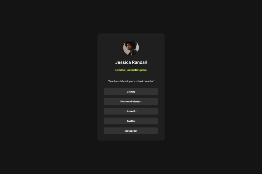
Design comparison
Solution retrospective
My version is nearly exactly the same as the original design. Next time I would try add some responsiveness to the sizing for different mobile devices, however it appears okay on my device at least already.
What challenges did you encounter, and how did you overcome them?How to create the buttons. I ended up using a section tag to add semantic meaning to the link section. I then used a div styled separately in style.css linked with a class and then wrapped that div in an a tag to make it a link.
Community feedback
- @solvmanPosted 3 months ago
Very well done! 🎊🎉 Your final result looks excellent 🚀
I have a few suggestions for you:
- ⭐️ Every HTML document should include the
<main>element to wrap the primary content. Such widgets as cards are more suited to be constructed with the<article>element, which encapsulates reusable, self-contained content. - ⭐️ Titles and headings are usually denoted by
<h1>,<h2>,<h3>, and so on. Do not skip levels of headings. Regular text is generally encapsulated by<p>.A card-like widget's most appropriate heading level is likely<h2>. - ⭐️ You do not need to wrap other elements in
<div>to style them. - ⭐️ You could use an unordered list semantic tag to display the list of links or buttons.
With that being said, I would redo your code as so:
<body>
  <main>
    <h1 class="visually-hidden">Frontend Mentor project submission</h1>
    <card class="main-container">
      <img src="images/avatar-jessica.jpeg" alt="Jessica Icon Logo" />
      <h2>Jessica Randall</h2>
      <p class="location">London, United Kingdom</p>
      <p>"Front-end developer and avid reader."</p>
      <ul id="links">
        <li><a href="#GitHub" class="link-button">Github</a></li>
        <li>
          <a href="#FrontendMentor" class="link-button">Frontend Mentor</a>
        </li>
        <li><a href="#LinkedIn" class="link-button">LinkedIn</a></li>
        <li><a href="#Twitter" class="link-button">Twitter</a></li>
        <li><a href="#Instagram" class="link-button">Instagram</a></li>
      </ul>
    </card>
  </main>
</body>
As mentioned above, the
<h2>heading is the most appropriate for the card-like widget. To avoid breaking hierarchy heading rules, I added an invisible<h1>heading to announce "Frontend mentor project submission" to accessibility users. Visually hidden class for the<h1>:.visually-hidden { position: absolute; width: 1px; height: 1px; padding: 0; margin: -1px; overflow: hidden; clip: rect(0, 0, 0, 0); white-space: nowrap; border: 0; }Learn more about semantic HTML elements here
Please remember that block-level elements stack one on top of the other. So you do not need to encapsulate them into an extra
<div>to apply styles or use <br /> to break the line. The only element that is not block level within the card is<img>,which could be "converted" to block level through a simple reset, which should be used almost on every project anyways:img { display: block; max-width: 100%; /* ensures images does not overflow the container */ }Otherwise, very well done!🎊 Keep it up!👏 I hope you find my comments useful 🫶
Marked as helpful1@tomblack9452Posted 3 months ago@solvman Incredible reply thank you! Yeah I'm slowly trying to figure out the best way to add meaning to my code with the proper tags rather than using div's everywhere. <3
1@solvmanPosted 3 months ago@tomblack9452
You are very welcome! HTML authoring is more like the art of conveying meaning with specific structures using semantic elements as your tools. I always try to think of accessibility users. What would happen if the page was read instead of visually seen? A good exercise is to run your project through a screen reader and hear your result.
Again, great job on your project. Thank you for your kind words!
1 - ⭐️ Every HTML document should include the
Please log in to post a comment
Log in with GitHubJoin our Discord community
Join thousands of Frontend Mentor community members taking the challenges, sharing resources, helping each other, and chatting about all things front-end!
Join our Discord
