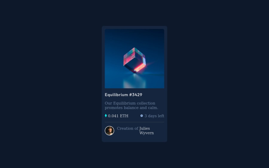
Design comparison
Solution retrospective
Any comments and suggestions would greatly be appreciated, anything I could be doing better? Any help will be appreciated.
Community feedback
- @VCaramesPosted about 2 years ago
Hey @stwslim83, some suggestions to improve you code:
- To center you content to your page, add the following to your Body Element:
body { min-height: 100vh; display: grid; place-content: center; }-
Apply the
background-colorto the Body Element. So that it takes up the entire screen. -
The overlay hover effect was not applied. Here is a link that will show you how to apply it.
https://www.w3schools.com/howto/howto_css_image_overlay.asp
-
The NFT Alt Tag description needs to be improved upon. You want to describe what the image is; they need to be readable. Assume you’re describing the image/icon to someone.
-
On illustrations/icons that you are removing from assistive technology, along with the blank alt-tag, you also want to include the aria-hidden=“true” to fully remove it from assistive technology.
-
Wrap the "NFT image", "Equilibrium #3429" and "Jules Wyvern" in an Anchor Tags <a>. The anchor tag will allow users to click on content and have them directed to another part of your site.
Happy Coding! 👻🎃
Marked as helpful0@stwslim83Posted about 2 years ago@vcarames I reworked the project to fix issues that you mentioned. I completely forgot to add the hover affect before. Any further suggestions on the rework i did would be greatly appreciated. Thanks :-)
0
Please log in to post a comment
Log in with GitHubJoin our Discord community
Join thousands of Frontend Mentor community members taking the challenges, sharing resources, helping each other, and chatting about all things front-end!
Join our Discord
