Not Found
Not Found
Not Found
Not Found
Not Found
Not Found
Not Found
Not Found
Not Found
Not Found
Not Found
Not Found
Not Found
Not Found
Not Found
Not Found
Not Found
Not Found
Not Found
Not Found

Submitted

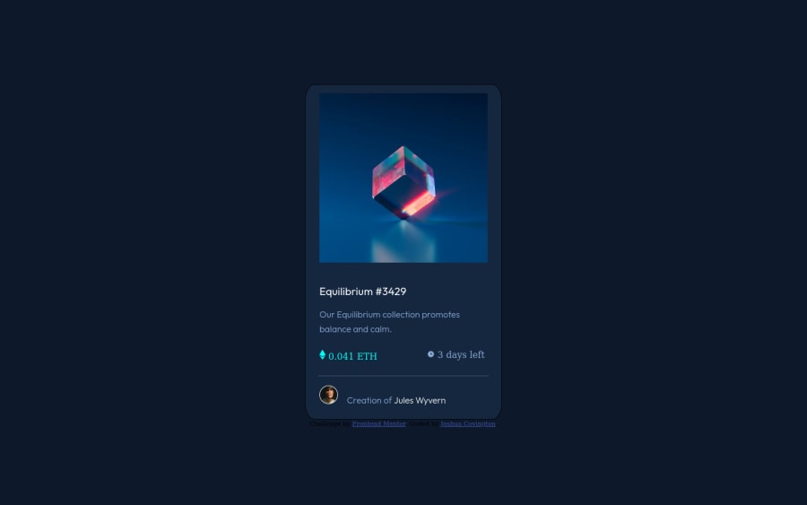
Equilibrium #3429

@jcovington16

Desktop design screenshot for the NFT preview card component coding challenge

This is a solution for...

  • HTML
  • CSS
1newbie
View challenge

Design comparison


SolutionDesign

Solution retrospective


Is it bad practice to separate majority of the elements on the page within their own div?

What's the best way to keep elements leveled amongst each other?

Community feedback

Vanza Setia 27,795

@vanzasetia

Posted

Hi, Joshua! 👋

Congratulations on finishing this challenge! 👏

Here are some suggestions for improvements.

  • All the page content should live inside landmark elements. Users of assistive technology can navigate through landmark elements. This will help them quickly navigate a website or application.
  • In this case, the children of the body element should be landmark elements - main for the card, footer for the attribution.
  • Use interactive elements for any elements that have interactivity. Interactive elements can either be links or buttons.
  • For your information, anchor tags are for navigation. The button elements are for actions like opening a modal, submitting a form, toggling element, etc. It is essential to use the correct elements.
  • Create a custom :focus-visible styling for any interactive elements (e.g. button, links, input, textarea). This will let people who use a keyboard to navigate the site know where they are currently on the page.
  • Replace the h3 with h1. Headings must be in a logical order.
  • There should not be text in span and div alone. Wrap the text with a meaningful element like a paragraph element.
  • The alternative text for the avatar should be the name of the person (alt="Jules Wyvern").
  • Alternative text for images should not contain any words that are related to "image" (e.g. picture, photo, logo, icon, graphic, avatar, etc). It is already an image element (img) so the screen reader will pronounce it as an image.
  • Use a CSS reset whenever you start a new project. This can help you set the styling foundation easily.
  • The card (.main) only needs a max-width to be responsive. So, set a max-width and remove the height and width. For the height of the card, let content inside the card controls it.

Related resources:

How-to: Accessible heading structure - The A11Y Project

Quick tip: Using alt text properly - The A11Y Project

A Modern CSS Reset

I hope this helps. Happy coding!

Marked as helpful

1

@jcovington16

Posted

@vanzasetia

I really do appreciate the feedback you've given me. I honestly didn't see your response, so I apologize for the late response.

I wanted to take the time just to go back over what you mentioned just, so that I have a better understanding regarding your comments.

  • Child elements in the body belong in landmark elements. Would a hero section be considered a landmark element?

  • I will definitely remember to not conflict between an anchor and a button. I've seen a lot of tutorials where I've seen that style of development.

  • Does the :focus-visible have a value that's associated with it?

Once again thank you very much for this feedback. I'm making changes now. I hope to get more feedback from you in the future.

0
Vanza Setia 27,795

@vanzasetia

Posted

@jcovington16

No worries at all!

About your questions:

  • The child elements of the <body> should be landmark elements, <main> for the card and <footer> for the attribution. Are you asking about the "hero" section on this challenge? I don't see any hero section. Also, <section> is not a landmark element.
  • I am not sure about your question regarding :focus-visible. :focus-visible is a pseudo-class selector. It is not a CSS property that has a value.

You are welcome!

0

@lukejans

Posted

I would practice semantic html. like using footer instead of <div class="attribution">. for your <div class="main"> I would highly recommend using the main tag instead as it helps for SEO and is meant to signify the main part of the document. as for the other divs i would use the sections tag instead to better describe to the browser what things are. Don't forget that html is built as a lang to describe what things are to the browser, everything is actually just a <div> (block level) or a <span> (inline) but with more significant meaning.

1

@jcovington16

Posted

@lukejans Thank you very much for the feedback. I'm going to keep these things in mind for the future. I also will make these changes necessary with the attribution div. I need to dive more into SEO topic because I honestly don't have a full understanding of that. I'm sure this will provide more insight with how I structure the frontend.

1

@lukejans

Posted

@jcovington16 When you use chrome dev tools via inspecting your webpage along the top bar where you see elements and console you should see something called light house. If you don't see it click the 2 arrows >> and it should be in a drop down menu. There you will find everything to have the best performing page possible.

Happy Coding

1

@jcovington16

Posted

@lukejans Thank you very much! I never knew about this feature, so I'm definitely going to start using this often.

0

Please log in to post a comment

Log in with GitHub
Discord logo

Join our Discord community

Join thousands of Frontend Mentor community members taking the challenges, sharing resources, helping each other, and chatting about all things front-end!

Join our Discord