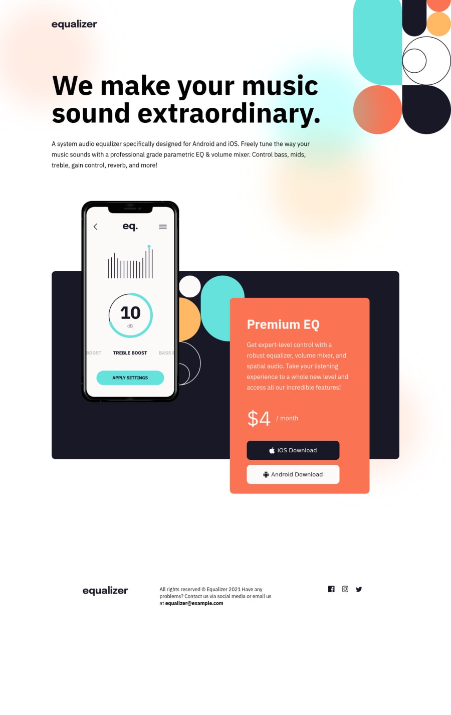
Not Found
Not Found
Not Found
Not Found
Not Found
Not Found
Not Found
Not Found
Not Found
Not Found
Not Found
Not Found
Not Found
Not Found
Not Found
Not Found
Not Found
Not Found
Not Found
Not Found

Submitted

equalizer-landing-page

Josh 100

@j-likes-spicy

Desktop design screenshot for the Equalizer landing page coding challenge

This is a solution for...

  • HTML
  • CSS
1newbie
View challenge

Design comparison


SolutionDesign

Solution retrospective


I found this challenge to be particularly tedious, however, I did my very best to get as close to the design as I possibly could. Unfortunately, it's not 100% picture-perfect. In addition, there were MANY lines of CSS written, which I'm sure is not ideal. Initially, I had the design looking almost perfect in the mobile and tablet versions. Sadly, my layout ended up breaking, so I decided to save a backup copy of my previous CSS file and start from scratch. This time around, I utilized a combination of CSS Grid, Flexbox, and absolute positioning. What I found to be the most difficult part of all of this is following the design guide in Figma to get the design as close as possible. Landing pages can be difficult at times, but overall, I did enjoy the complexity of this project. I started off by doing a generic CSS reset, followed by setting universal styles at the top of the document. From there, I targeted CSS classes within media queries to make sure that the layout wouldn't break. I noticed that I forgot to do a few little things within the project, so I'll update those changes later. As always, I'm super open to just about any form of advice or feedback, whether it be positive or not so great. Take a look, let me know what you think (and maybe what I could do differently next time). Thanks for checking this out!

Community feedback

Vanza Setia 27,795

@vanzasetia

Posted

Hi, Josh! 👋

Congratulations on finishing this challenge! 🎉

Yeah, this challenge is hard for me too. I did even do a git revert because of the messy CSS code that I wrote on my first attempt. 😅 Fortunately, I was able to finish the challenge.

First, you need to improve the HTML.

  • The header should only contain the logo. The h1 and the paragraph should live inside the main element.
  • Alternative text for images should not contain any words that related to image (e.g. picture, photo, logo, icon, graphic, avatar, etc). It's already an image element so the screen reader will pronounce it as an image.
  • I strongly recommend using pseudo-elements for the phone illustration and bg-pattern. This way, you can remove all the empty div. As a result the HTML can be more simple and cleaner.
  • There should not be text in span and div alone whenever possible; instead wrap the text with a meaningful element like paragraph element. In this case, $4/month should be wrapped by one p element and then you can wrap each text with span for styling purposes.
  • The download buttons should be link elements with download attribute, not a button element. Regardless, if you ever want to use the button element, always specify the type of the button. It's going to prevent the button from behaving unexpectedly
  • Those Android and iOS icons are decorative so I suggest leaving the alt empty.
  • For the email address, I recommend wrapping it with an anchor tag instead of strong tag. You can use mailto:[email protected] as the value of the href attribute.
  • Social media icons should be wrapped by anchor tags. They are the social media links for the company (if this is a real website).

Then, you can improve the CSS.

  • 16px is the default font size so you don't need to specify it.
  • I recommend simplifying the media queries. I recommend only using the min-width media query (only one condition) because I had done this challenge only using min-width media query (mobile-first approach) and I think the media queries don't need to be this complex.
  • Prefer unitless numbers for line-height values to avoid unexpected results. The MDN documentation explains it well.👍
  • I recommend adding max-width to the container (and making it horizontally center) to prevent the layout looks broken on wide screen.

I hope this helps! Keep up the good work! 👍

Marked as helpful

0
Josh 100

@j-likes-spicy

Posted

Thanks Vanza! These are all really great tips! I didn’t even think to use pseudo-elements 🤦‍♂️ lol. I plan to clean this up a bit over the weekend.

0

Vanza Setia 27,795

@vanzasetia

Posted

@j-likes-spicy No problem! 👍

P.S. Next time, I recommend replying to the comment by clicking the REPLY word (at the top right corner). This way, I will get a notification. I know this one by clicking the activity tab and seeing this reply. So, lucky for you. 😁

0
Josh 100

@j-likes-spicy

Posted

@vanzasetia Sounds good! I replied for the first time using my mobile device and the site had to re-authenticate me lol. Good to know, thanks again :D!

0

Please log in to post a comment

Log in with GitHub
Discord logo

Join our Discord community

Join thousands of Frontend Mentor community members taking the challenges, sharing resources, helping each other, and chatting about all things front-end!

Join our Discord