Design comparison
Solution retrospective
Hey there (from 🇧🇷 ) :),
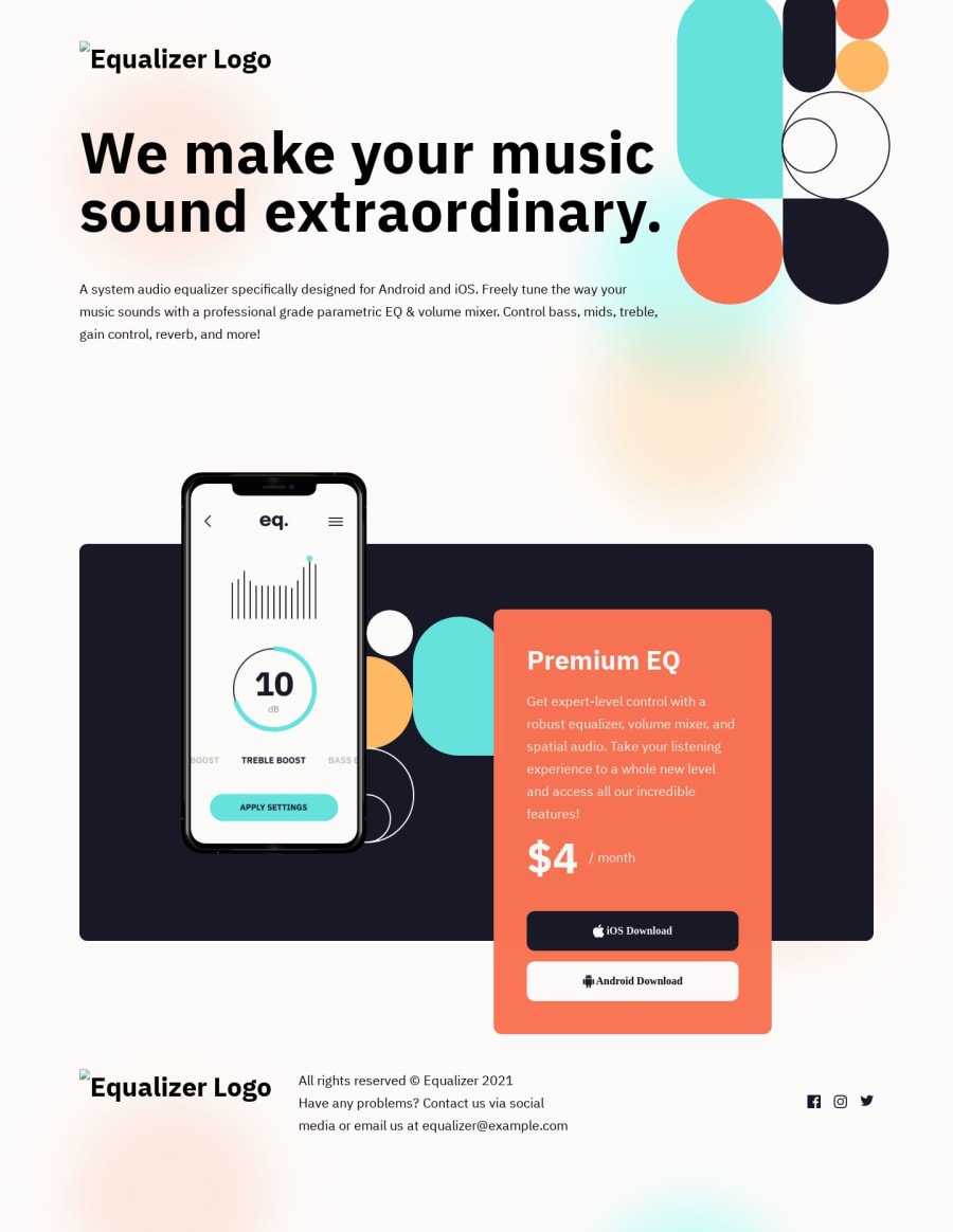
I will appreciate feedback on how you manage the placement of the image ( app inside the cellphone) along with the red card, as I had a hard time changing them from desktop-tablet-phone.
Also, I took a lot of time to do the top right illustration, as I started using only flex, than switched to only Grid, to only then mixed them both. If you can please share ways to identify and quickly execute a illustration like this one will be of great value for me.
Thanks for the advice :)
Community feedback
- @itushPosted over 1 year ago
Congratulations on completing the challenge! 🎉
-
It is important to correctly understand flexbox / grid to render HTML elements as per the requirement. I struggled in my initial projects, since I didn't understand it correctly.
-
I remember when I started out, I made countless mistakes and spent long hours searching for solutions. But hey, you don't need to go through the same struggles! 🙌 To help you shorten the learning curve, I recommend going through the following articles. They contain valuable insights that can make your journey smoother:
📚🔍 12 important CSS topics where I discuss about css position, z-index, box-model, flexbox, grid, media queries, mobile-first workflow, best practices etc. in a simple way.
📚🔍 11 important HTML topics where I discuss about my thought process and approach to convert a design/mock-up to HTML along with other topics.
I hope you find these resources helpful in your coding adventures! 🤞
I'm eagerly looking forward to seeing the amazing projects you'll create in the future! 🚀💻
Keep up the fantastic work and happy hacking! 💪✨
Marked as helpful0 -
Please log in to post a comment
Log in with GitHubJoin our Discord community
Join thousands of Frontend Mentor community members taking the challenges, sharing resources, helping each other, and chatting about all things front-end!
Join our Discord
