Design comparison
SolutionDesign
Solution retrospective
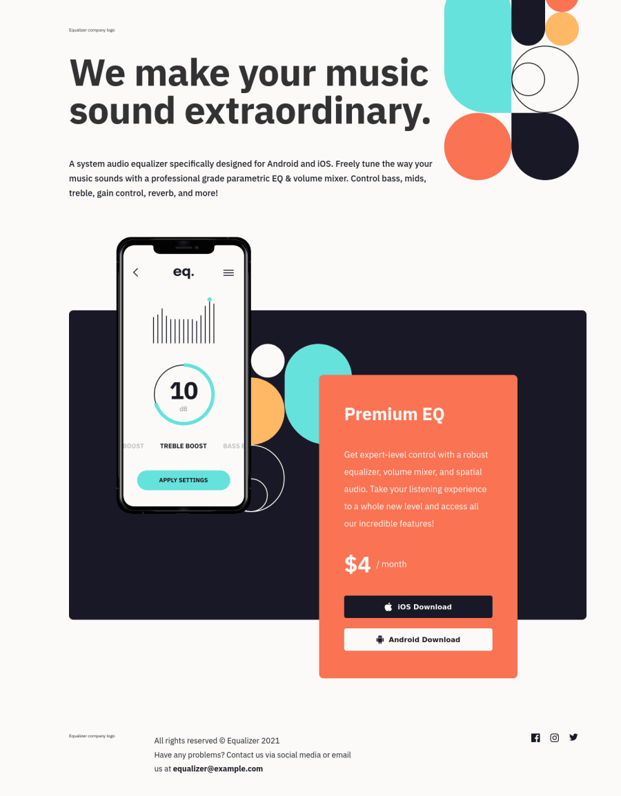
Found this challenge quite difficult, particularly around the images and positioning. Tried to use Flexbox and absolute positioning to take elements out of flow and reposition according to design.
Would be grateful if anyone can take a look at some of the element positioning, tinkering with padding/margins/top/right feels a bit 'dirty' - not sure if there is a better way to arrive at the desired outcome!
Thank you FM community!
Community feedback
Please log in to post a comment
Log in with GitHubJoin our Discord community
Join thousands of Frontend Mentor community members taking the challenges, sharing resources, helping each other, and chatting about all things front-end!
Join our Discord
