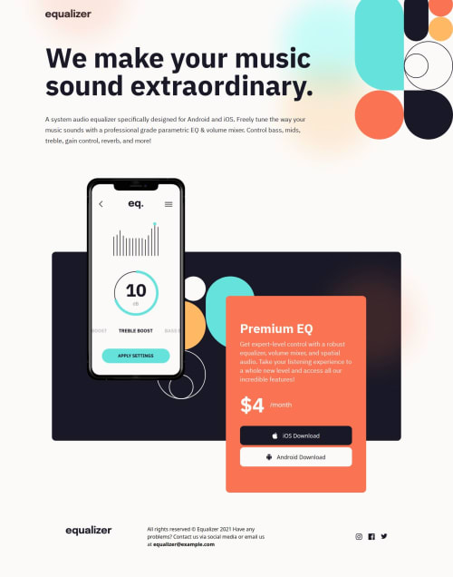
Submitted over 1 year agoA solution to the Equalizer landing page challenge
Equalizer Landing Page
tailwind-css, next
@reactaleks

Solution retrospective
What are you most proud of, and what would you do differently next time?
As part of this simple and yet not so simple project i have learned alot about layout, positioning and units of measure. This was a simple but yet very challenging exercise and i had to rewrite my layouts quite a bit.
What challenges did you encounter, and how did you overcome them?Adding background patterns based on the size of the device, due to using next js i had to write a background pattern component which would return background pattern based on the width of the screen.
Code
Loading...
Please log in to post a comment
Log in with GitHubCommunity feedback
No feedback yet. Be the first to give feedback on Aleks's solution.
Join our Discord community
Join thousands of Frontend Mentor community members taking the challenges, sharing resources, helping each other, and chatting about all things front-end!
Join our Discord