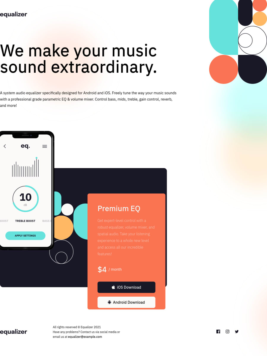
Design comparison
Solution retrospective
Got some trouble at first, had to delete my first version and rebuild it from scratch.
- difficulties to organize my self for the media query. Looks like i did it upside down. I should have start with the simplicity layout and go toward the more complex one. (From the phone to the bigger screen for that exercise.)
- Also, I should get away from the px - i should use more responsive unites measure. But how should i use better Rem or vh, i understand what they do but i don't get, yet, how to use it properly especially for an exercise like that.
Please log in to post a comment
Log in with GitHubCommunity feedback
- @Jawha3
Hey Nazemrap - great work getting it done despite the struggles.
I've recently learned myself to definitely use the mobile-first approach as it makes everything so much easier and you will end up with less redundant work.
In terms of using rem, vh, vw - I personally use rem a lot especially for elements that are crucial such as font-size, margins and paddings. I am still learning to use vh and vw properly but from what I understand a vw length is relative to the full width of the browser window and of course a vh would then be the full height of the browser window.
So if you used vw for font-size you could use calc() so the font-size doesn't scale drastically and becomes super small and unreadable. I reccomend checking this out: https://css-tricks.com/fun-viewport-units/ to learn more about it.
I hope that shines some light on your difficulties. :)
Marked as helpful - @vanzasetia
Greetings, Nazemrap! 👋 Good effort on this challenge! 👍
Regarding your questions.
- I would recommend writing the styling with the mobile-first approach. It often leads to shorter and better performance code. Also, mobile users won't be required to process all of the desktop styles.
- Like @Jawha3 said to you, the
remunit is going to be the main unit in the stylesheet. There's alsoemunit which is relatives to thefont-sizeof the parent element. All things that commonly usepxcan be converted intoremunits. I only usevhunit for the card component challenges, usually to make the card in the center vertically while using flexbox.
Some feedback.
- I notice that there are some
font-familyproperties in the stylesheet. I would recommend putting the same styling once for the same elements. It's going to prevent you from writing the same styling. Even better, since this site only uses one font family, you can put thefont-familyproperty on thebodyelement. Most elements inherit the styling from thebodyelement so you don't have to keep specifying the font family for each element.
h1, h2 { font-family: 'IBM Plex Sans', sans-serif; }headerelement should only contain the logo and thenavelement.- The alternative text for the logo should be the name of the company which in this case, Equalizer. Alternative text for images should not contain any words that related to image (e.g. picture, photo, logo, icon, graphic, avatar, etc). It's already an image element so the screen reader will pronounce it as an image.
- Not all images need alternative text. In this case, all the illustrations and social media icons are decorative which means that you can leave the
altempty. By doing this, you prevent the screen reader users from listening to unrelated content. For the illustrations, you can make them as background images or pseudo-elements if you want. - Use interactive elements (
a) for the download buttons.
That's it! I hope this information is useful! 😁
Marked as helpful
Join our Discord community
Join thousands of Frontend Mentor community members taking the challenges, sharing resources, helping each other, and chatting about all things front-end!
Join our Discord
