Design comparison
SolutionDesign
Solution retrospective
Hi everyone!
Finally submitting this challenge which I struggled with more than usual. Please if you can and have the time, provide as much feedback as possible, I do read and take in all your advice and obviously it helps immensely for us beginners aiming to become a better developers!
Main areas I struggled with:
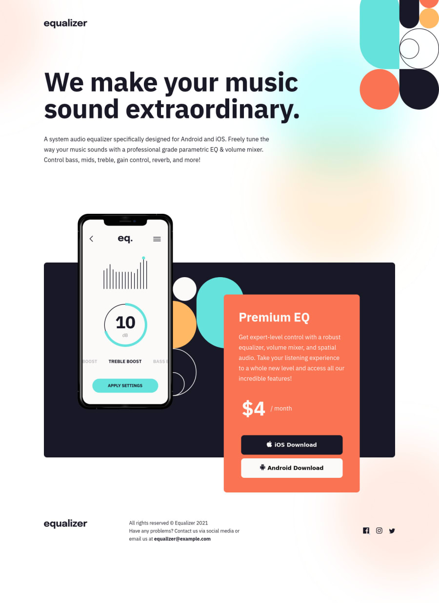
- Blurred circles background image - really struggled with this one, eventually decided to create a div in the html with a .bg class name which after I set the height of it to 100% wouldn't actually cover 100% of the body (which was also at 100%). Then I had a hard time scaling and positioning the background to match the original design so I'm curious to see what you guys did.
- Sass - it seems that because I used Sass for the first time on one of these project the code feels a lot messier or cluttered than it should, please let me know your thoughts.
- SVG social icons - I couldn't find a way to add a hover effect to the social media icons unless I added the SVG code as inline in the HTML file and then used the fill property. Did anyone find another way of solving this? Also there is a weird underscore line _ next to the Facebook icon which seems to be part of the image, anyone else's has that?
- Media queries and responsive layout - I'm not completely unsatisfied with how this turned out however as the screen size increases the layout doesn't match the original design until it reaches the screen width specified in the design documents, I would imagine this is normal but let me know if you think differently and if basically I should have matched the exact design on figma for the whole range between device sizes, so for example the desktop layout design should look as the one provided from 1025px device width all the way to 1440px width and beyond ... (hopefully this makes sense)
Thank you so much for your help guys, hope to hear from you soon!
Community feedback
Please log in to post a comment
Log in with GitHubJoin our Discord community
Join thousands of Frontend Mentor community members taking the challenges, sharing resources, helping each other, and chatting about all things front-end!
Join our Discord
