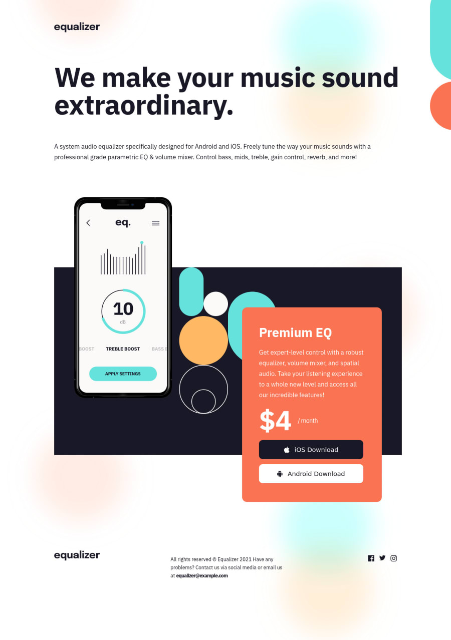
Design comparison
Solution retrospective
how to make this better please?\
Community feedback
- @iamenochleePosted over 2 years ago
Hey there, congratulations on your Challenge, Your solution seems to have a vertical scrollbars, well you can correct this, by using this styles
body{
margin: 0;
width: 100%;
overflow-x: hidden;
}

header{
width: 75%;
}

.pattern{
left: 69em
}
But this is not an efficient way, a much better way is to add the pattern as a background-image to the body for just tablet to desktop screen-sizes, since its not needed on mobile, or perhaps reposition outside the viewport for mobile, then position it top, right, i will link an article on working with two or more background image, also an article on css resets. Keep coding!.
0
Please log in to post a comment
Log in with GitHubJoin our Discord community
Join thousands of Frontend Mentor community members taking the challenges, sharing resources, helping each other, and chatting about all things front-end!
Join our Discord
