Design comparison
SolutionDesign
Solution retrospective
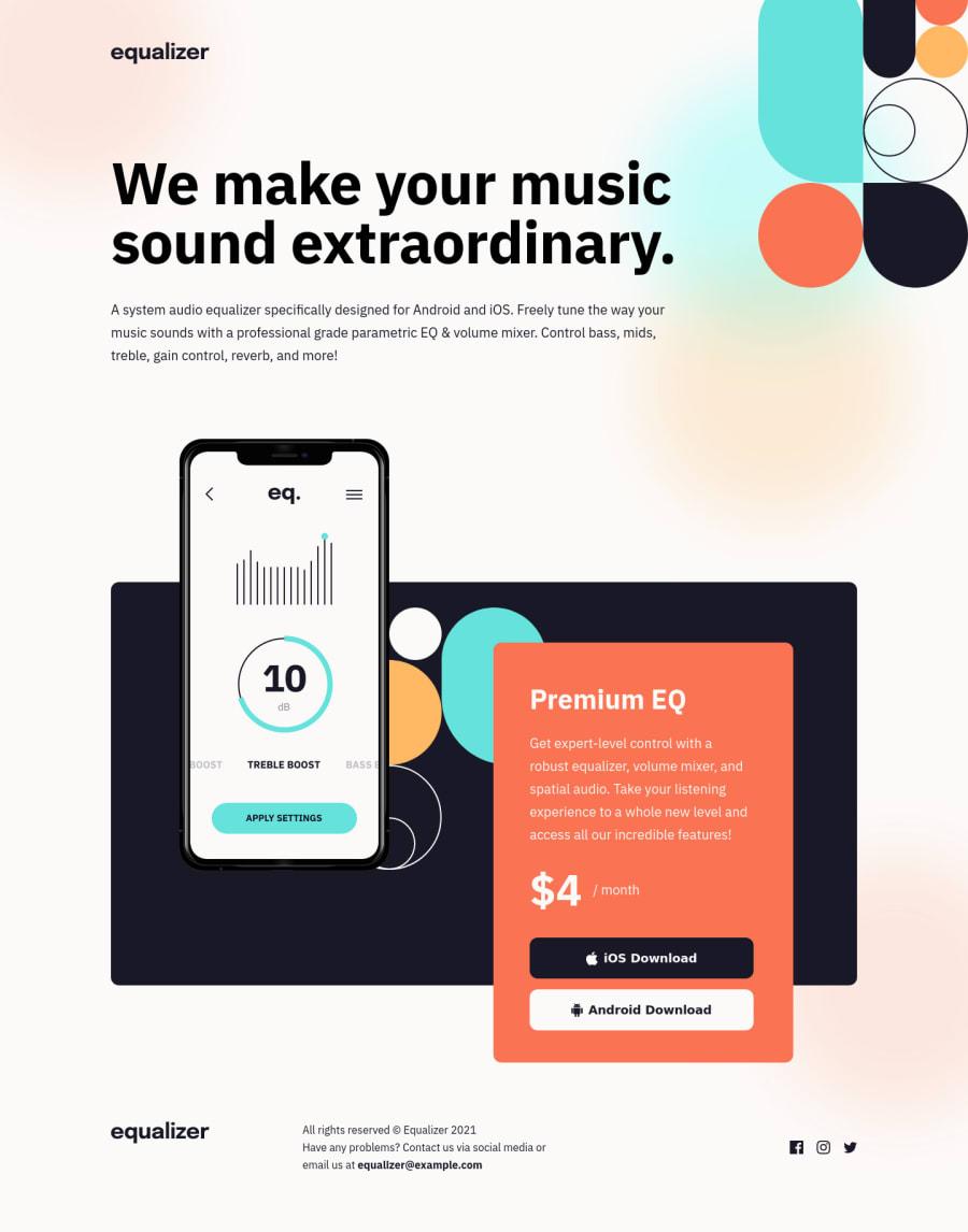
I couldn't quite figure out how to get the background image to align exactly as shown in the Figma mocks with the color blobs appearing in the right places. I got it pretty close in the desktop layout using background-position: top -250px center; but it was a bit off in the mobile view. Did anyone figure out a better way to do this?
Community feedback
Please log in to post a comment
Log in with GitHubJoin our Discord community
Join thousands of Frontend Mentor community members taking the challenges, sharing resources, helping each other, and chatting about all things front-end!
Join our Discord
