Design comparison
Solution retrospective
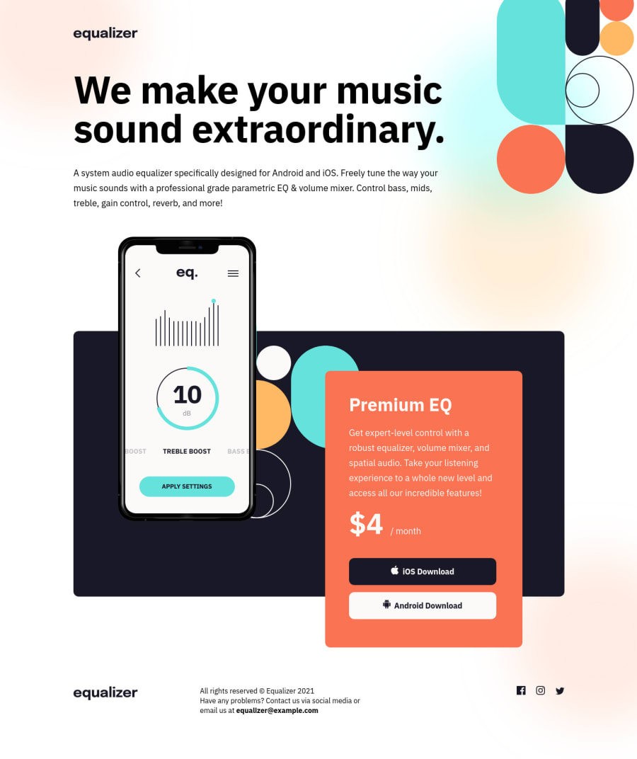
I've used HTML semantics and tried to avoid too many div-tags but if someone has any feedback as to how I could have improved it more it will be much appreciated and so would feedback towards the rest of the solution also, thank you.
Revised 11-03-22 Solution is now responsive. I would love to get some feedback on my approach - I used mobile-first workflow and I tried making it look decent on all screen sizes. I was a bit unsure what to do in the really large screens such as 2560px - I've seen people change the layout quite a bit and others have just added more of a margin to put the content more centered. I feel like to get away with the first option would require sizing everything up a little so it doesn't look so off in terms of the background shapes behind the app illustration. And I'm personally not a fan of just pushing everything to center page on those huge screens but I'm not sure what best practice is in this case - if anyone can shine some light on that, that would be very much appreciated!
Please log in to post a comment
Log in with GitHubCommunity feedback
- @vanzasetia
Good effort on this challenge, Jannie! 👍
Thank you for your kind words on my solution! I really appreciate it! 👍
Anyway, about the responsiveness, I would recommend making the layout into the center by adding a
max-widthandmargin: 0 autoto the container of the page. For your information, those people who have wide-screen devices usually zoom in to see the website. Also, in this case, I don't see any reasons to not make the layout to the center.More suggestions on this solution.
- In this case, all images are decorative which means that if they don't exist, the user still is able to understand the page content. So, I would recommend leaving the
altempty or even better making them background images or pseudo-elements. - Regarding the semantic HTML, in this case, you don't need to have
articleorsectionactually. It doesn't hurt the accessibility if you have them however, it might cause a lot of noise for screen reader users or they are the same asdiv. The thing is if you want them to be recognized as a distinct section then usesectionorarticleand make sure it has a label (heading). - The download buttons should be link elements with
downloadattribute. Just to let you know thatbuttonelements are for actions like opening a modal, submitting a form, toggling element, etc. Also, next time you want to usebutton, always specify thetypeof thebutton. It's going to prevent the button from behaving unexpectedly.
That's it! Hope you find this useful! 😁
- In this case, all images are decorative which means that if they don't exist, the user still is able to understand the page content. So, I would recommend leaving the
- @alexandretoullec
great work
Join our Discord community
Join thousands of Frontend Mentor community members taking the challenges, sharing resources, helping each other, and chatting about all things front-end!
Join our Discord
