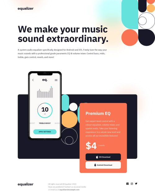
Submitted almost 2 years agoA solution to the Equalizer landing page challenge
Equalizer Landing Page
@Mitko90

Solution retrospective
I got frustrated with this project and decided to leave it and submit it as is.
I had an issue with the positioning of the background image, the overlapping, but my main issue is that when I inspect the page in the browser (Firefox, Linux), everything looks fine on mobile resolution (375px), but when I open the page on my phone (Chrome, Android, same 375px resolution), the design is off.
Any help will be greatly appreciated.
Thank you
Code
Loading...
Please log in to post a comment
Log in with GitHubCommunity feedback
No feedback yet. Be the first to give feedback on Dimitar Radev's solution.
Join our Discord community
Join thousands of Frontend Mentor community members taking the challenges, sharing resources, helping each other, and chatting about all things front-end!
Join our Discord