Submitted almost 2 years ago
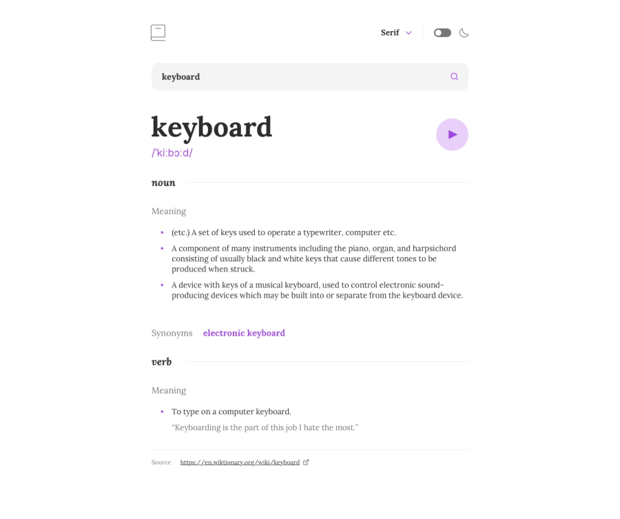
Entire site funcionalities based just on the screenshot
@nxtime
Design comparison
SolutionDesign
Solution retrospective
I was having trouble trying to setup a debouncer, to prevent heavy requests on the api, but I got it working, and way better than what I was expectating.
Community feedback
- @RubenSmnPosted almost 2 years ago
Hi Marcos, great UI and the great use of Framer Motion. I myself am trying to learn it because I think it is very powerful and can make great animation as you showed.
I really like that the url reflects the state of the input, very handy and good feature for the UX.
I did found some things that I think you could improve upon.
- you can play the button before you searched anything, this seems a bit odd.
- when searching for the word bubble the user is not able to view all the information down to the bottom
0
Please log in to post a comment
Log in with GitHubJoin our Discord community
Join thousands of Frontend Mentor community members taking the challenges, sharing resources, helping each other, and chatting about all things front-end!
Join our Discord
