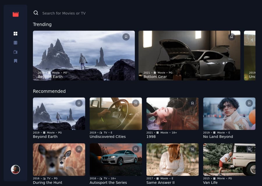
Design comparison
Solution retrospective
This will be one of the projects I display on my portfolio when I start the job search soon. It was my first full-fledged React project and with that in mind I'm quite happy with how it turned out. Any feedback would be appreciated!
Community feedback
- Account deleted
Hey mate,
Good job for the most part it looks quite good!
One thing I noticed is that your recommended section contains items that are in the trending section. They are not meant to be included here.
Also your search functionality always returns the word "Results" even if there is only 1 result. This is obviously grammatically incorrect. You can fix this issue by conditionally rendering result(s) depending on how many entries are returned, if it 1 it will be "Result" if it is anything else it'll be "Results"
One last suggestion I would have as a general UX thing would be to reset the search results when you click on a different category. That way it always shows all of the items before you start searching. This will help users because the search bar will always say "Search for x" before they search anything, especially when clicking on a new category. this is up to personal preference though.
Apart from that good job!
0
Please log in to post a comment
Log in with GitHubJoin our Discord community
Join thousands of Frontend Mentor community members taking the challenges, sharing resources, helping each other, and chatting about all things front-end!
Join our Discord