Entertainment Web App - React, Redux, ChakraUI, NextJS, Emotion
Design comparison
Solution retrospective
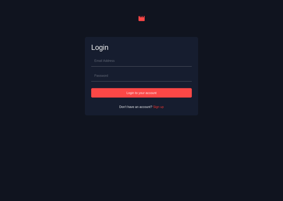
This still needs some refactoring, but so far I'm pleased with the results. The main page redirects to the login page until you sign in. It will accept anything so long as both fields are not empty. I'm open to any and all feedback!
Community feedback
- @Ging3rmintPosted over 2 years ago
Looks pretty good! more ways to improve could be adding validation to the email field, using a carousel for the trending videos, and matching the font size, margin, and padding using Figma inspect. I recommend react-slick for the carousel.
1@djblackettPosted over 2 years ago@Ging3rmint Thanks for the feedback! Much appreciated! I'll definitely check out react-slick and add validation for the email field. As for the styling..
Any thoughts on how to go about matching the margins and padding to the designs? At first I tried to do so, but because I had hardcoded some of the values, it wasn't very responsive. All of the sizes in between the 3 in the design didn't work well. I ended up with something that worked but only approximated the design specs.
Sort of thinking out loud here...
Would it make sense to compare the pixel values of the various components in the figma design to the page width and calculate all widths as percentages and all grid columns as "fr" units? Then use custom breakpoints to make the layout change at the correct widths, but then the %'s and fr's will make everything in between those layouts scale with the device width?
0@Ging3rmintPosted over 2 years ago@djblackett It is important to understand the specification of your web application. What is the min screen and max screen your app can support? In my 2 years of experience as a front-end dev, we always use pre-defined breakpoints and media queries in CSS. you should never calculate the sizes manually as it will take a lot of performance. You can check out the version i built to see how i actually did it.
There are two approaches to responsive design. Desktop first or mobile-first approach. Do either but not both at the same time then use media query to transition.
Marked as helpful1@djblackettPosted over 2 years ago@Ging3rmint FYI, the link to your github repo doesn't work. Perhaps it is a private repo?
I get what you mean with the layout. I think what I ended up doing wasn't terribly far off, but I think the built in breakpoints for ChakraUI are working against me. The way yours works is how I had hoped mine would work, but I didn't quite get all the way there. I'd love to check out your code and see how you did it.
0@Ging3rmintPosted over 2 years ago@djblackett oops. it is set to the public now. feel free to clone it :) yea I would advise you to try to do the CSS/SCSS manually i don't really use a lot CSS libraries because of this reason.
1
Please log in to post a comment
Log in with GitHubJoin our Discord community
Join thousands of Frontend Mentor community members taking the challenges, sharing resources, helping each other, and chatting about all things front-end!
Join our Discord