Submitted over 2 years agoA solution to the Entertainment web app challenge
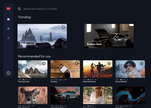
Entertaiment web app build with MERN stack
express, mongodb, node, react
@ZybartasRingys

Solution retrospective
Hello Everyone, I finally completed another challenge! 🎉 I know it's been a while, but I'm happy to submit my very own MERN stack solution to this challenge. 😆
This was insane challenge to make it work from scratch.
There were quite a few things I had to learn in order to complete this challenge, and I'm not sure if I did them all correctly. So feedback on both the design and code is welcome and appreciated! 😃
Code
Loading...
Please log in to post a comment
Log in with GitHubCommunity feedback
No feedback yet. Be the first to give feedback on Zybartas's solution.
Join our Discord community
Join thousands of Frontend Mentor community members taking the challenges, sharing resources, helping each other, and chatting about all things front-end!
Join our Discord