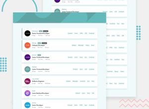
Design comparison
Community feedback
- @eng-milanPosted over 1 year ago
well done. this one is a good smooth design in my opinion. It looks like your accessibility report shows 2 suggestions. 1.Document should have one main landmark which means you should add a main landmark to your main container. Either using <main></main> element instead of containing div or leave it as a div and give it a role of main like so <div role="main"></div> 2. Page should contain a level-one heading It wants us to add at least one h1 to the project. Since this project appears to have no main heading for h1, we can add a <h1> and give it a display of none.
Hope this'll help you. In the end again, very good job I liked it.
Marked as helpful0
Please log in to post a comment
Log in with GitHubJoin our Discord community
Join thousands of Frontend Mentor community members taking the challenges, sharing resources, helping each other, and chatting about all things front-end!
Join our Discord
