Solution retrospective
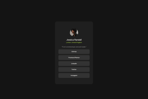
I’m proud of how the project turned out visually and functionally. The responsive design meets accessibility standards, and the card component adapts well across various screen sizes, from mobile to desktop.
What challenges did you encounter, and how did you overcome them?One of the main challenges was achieving a fully responsive design that looked good on both small mobile screens and large desktops. I encountered issues with layout shifts and scaling content proportionally. To tackle this, I used CSS flexbox and media queries to adjust the layout based on screen size, ensuring that elements aligned correctly and resized smoothly.
Please log in to post a comment
Log in with GitHubCommunity feedback
No feedback yet. Be the first to give feedback on KunalLabs's solution.
Join our Discord community
Join thousands of Frontend Mentor community members taking the challenges, sharing resources, helping each other, and chatting about all things front-end!
Join our Discord