Design comparison
Solution retrospective
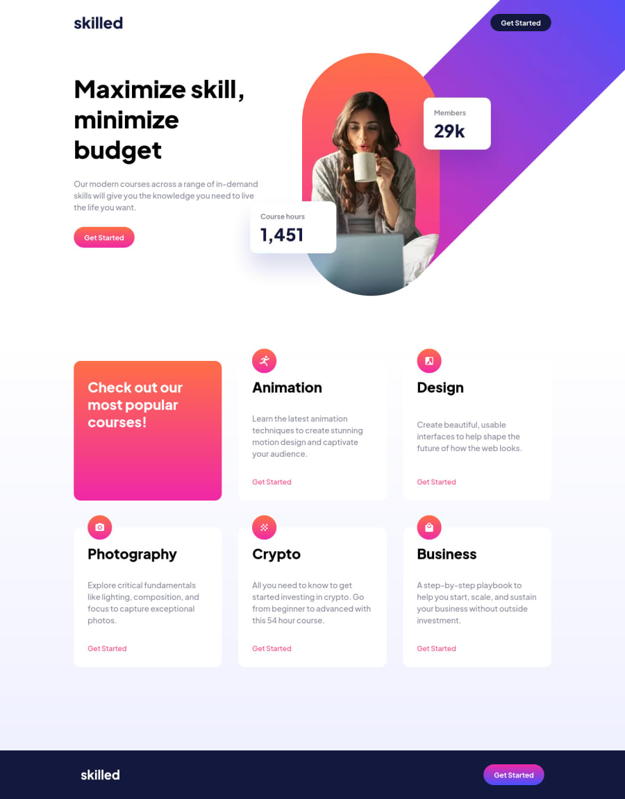
Confused about the hero image. Need some pointers on how to do it better.
Community feedback
- @correlucasPosted about 2 years ago
👾Hello QORI EL-HAFIZH, congratulations for your new solution!
Your solution is working perfectly, I know how it is this challenge, the image is really tricky, I build my solution differently, using
overflow: hiddento make the hero image get cropped and its position withposition: absolutemanaging the custom positions withtransform: translateX().👨💻Here's my solution for this challenge if you wants to see how I build it: https://www.frontendmentor.io/solutions/skilled-elearning-landing-page-vanilla-css-wr-dMF3Qk1
👋 I hope this helps you and happy coding!
Marked as helpful1
Please log in to post a comment
Log in with GitHubJoin our Discord community
Join thousands of Frontend Mentor community members taking the challenges, sharing resources, helping each other, and chatting about all things front-end!
Join our Discord
