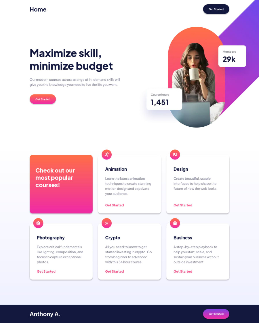
Design comparison
Solution retrospective
Hi everyone, I would like to recieve any feedback regarding to how I set the font-sizes in a responsive way playing with viewport units, maybe if somebody have a suggestion or a better practice for that, I would really appreciate it.
What I found the most hard, was trying to place the image, end up with some position absolute.
By the way, I think my HTML markup for responsive images it's a bit to long, I know this can be shorten with components in React/Vue/Angular, but if somebody has another way to do this in a more fancy way, please comment it down below. Thanks everyone.
Community feedback
- @SurgetinPosted over 2 years ago
Hi @Anthony, I would suggest set the @media (max-width) maybe to 700px. Your '23.44em' is way too small in that case, and I would resize your padding on 'features-card' in smaller size.
1 - @VCaramesPosted over 2 years ago
Congrats on completing this challenge!
Regarding your question regarding font-size with vw, I have attached a link on to do so properly: The video will start where he goes into detail about vw but I recommend watching the entire thing.
https://youtu.be/wARbgs5Fmuw?t=438
Regarding your images, the reason its too long, it's because you added unnecessary image formats (webp/png), you don't need both.
So it should like this (if you with webp images):
<picture> <source media="(max-width: 23.44em)" type="image/webp" srcset="assets/image-hero-mobile.webp, assets/[email protected] 2x"> <source media="(max-width: 48em)" type="image/webp" srcset="assets/image-hero-tablet.webp, assets/[email protected] 2x"> <img srcset="assets/image-hero-desktop.png, assets/[email protected] 2x" alt="Hero Image" class="hero__img"></picture>1@874anthonyPosted over 2 years ago@vcarames Hey, thank you for taking your time to review my solution.
Yeah, the reason I did that it's because I read on MDN that still some browsers maybe can't support webp, so that reason (The way I know picture works) if can't load webp, will load PNG, right?
So I don't know if maybe that's unnecesary and now all modern browsers supports webp, but just in case.
And thanks for the video. I also recommend for anyone reading this, take this one too.
0@VCaramesPosted over 2 years ago@874anthony
At this point its fully supported but its always good to have fallback like you did (you can also just add alt Attribute, in case it doesn't load).
Kevin Powell is defiantly a good source of information.
clamp is good when it comes to fluid text and fluid spacing; removes the need for a media query for font-size.
Marked as helpful1@874anthonyPosted over 2 years ago@vcarames
Oh yeah, I kinda forgot the alt attribute for this case haha, will take that in mind for next projects. Thanks.
0
Please log in to post a comment
Log in with GitHubJoin our Discord community
Join thousands of Frontend Mentor community members taking the challenges, sharing resources, helping each other, and chatting about all things front-end!
Join our Discord
