

Design comparison

Solution retrospective
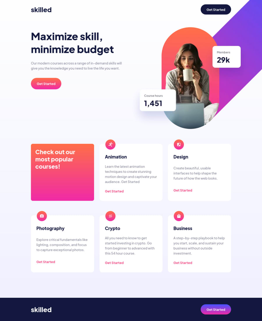
Dear god working with the images drove me crazy. I went from trying to get it to stay in the corner so I made it a background image, but that looked weird on the widest screens (in retrospect I realize I could've just given that portion of the site, what I called the header, a max width as well 🤦🏾♂️. At any rate, I built an image component instead and used an image tag. I positioned it's wrapper with flex box and the image within with absolute positioning. I also didn't make it responsive so that it didn't shrink with the screen which looked weird. If anyone out there has a better solution, I'm all ears 😂
Community feedback
- @iamenochleePosted over 2 years ago
lol, i don't have access to this course but i believe you have an horizontal scrollbar at some point due to the fact that you used
top: xxx, right: xxx, and position: absoluteto fit it, this can be fixed with more media queries, but the way i will approach this design is to not add a general margin or padding to the header, or absolute position to the image , then just give the header a{display: flex; justify-content: space-between}then apply a max-width to the image. for the content (i.e class of heading card) I would apply it a margin-left, and some margin and padding to the nav, imo making sure that my body has a width and max with of 100%. nice work, keep it coding.1@dorian-edwardsPosted over 2 years ago@iamenochlee Yeah flexbox was my first approach but the image provided doesn't look like the design, it has to be offset from the screen to achieve that effect. I readjusted some positioning and just disabled horizontal setting my main tag to
overflow-x: hidden;on my second attempt. Thanks for the advice!1


Please log in to post a comment
Log in with GitHub
Join our Discord community
Join thousands of Frontend Mentor community members taking the challenges, sharing resources, helping each other, and chatting about all things front-end!
Join our Discord