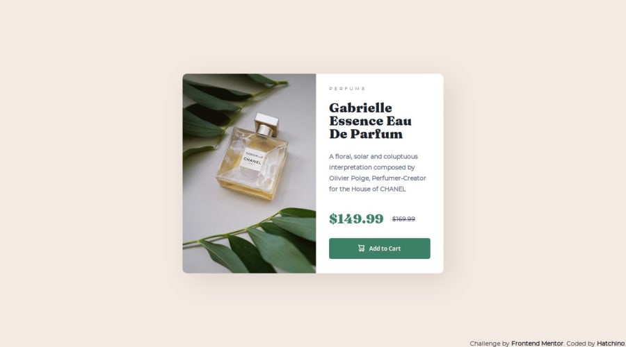


Design comparison
SolutionDesign

Solution retrospective
At first I thought that the project would be very simple to carry out but I was wrong. I had difficulty centering the card, using flexbox, modifying the fonts (I couldn't put them in bold). I am not satisfied with my responsive. I had to tinker so that the button wouldn't come out of the card and I didn't know if everything had to fit on one page for the mobile version. I would like feedback on this part of my code.
Community feedback
Please log in to post a comment
Log in with GitHub
Join our Discord community
Join thousands of Frontend Mentor community members taking the challenges, sharing resources, helping each other, and chatting about all things front-end!
Join our Discord