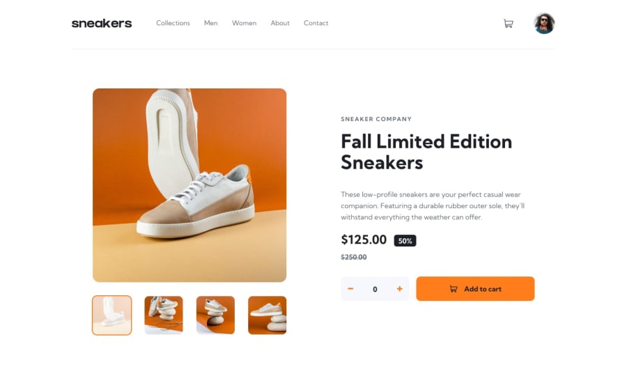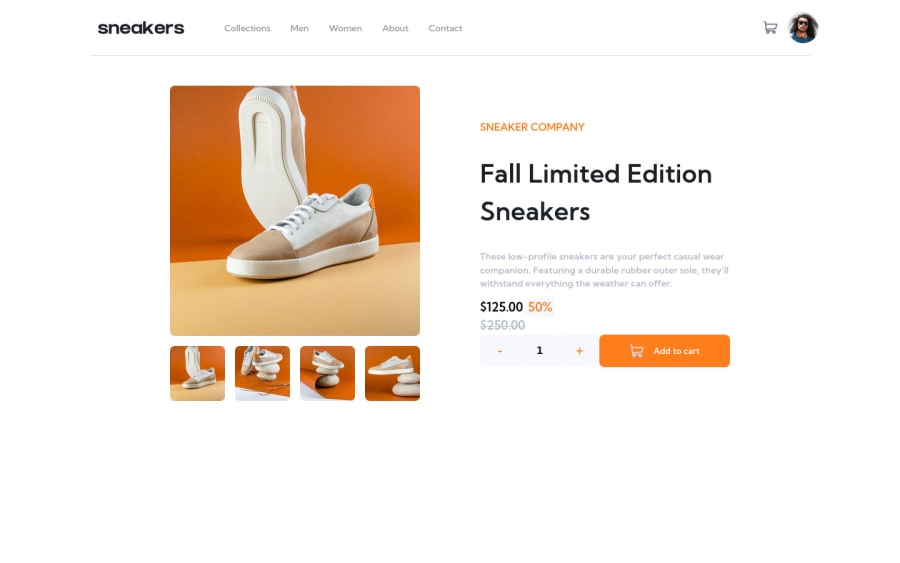
Design comparison
Solution retrospective
hello, just finish this challenge ,it was pretty dificult for me,especially lightbox! any advice is welcome !
Community feedback
- @AdrianoEscarabotePosted about 2 years ago
Hi superOzzy, how are you?
I really liked the result of your project, but I have some tips that I think you will enjoy:
- images must have alt text unless it is a decorative image, for any decorative image each IMG tag must have empty
alt=""
and addaria-hidden="true"
attributes to make all the assistive technologies of the Web, as screen reader. Learn the differences between decorative/meaningless images vs important content.
The rest is great!
I hope it helps... 👍
0 - images must have alt text unless it is a decorative image, for any decorative image each IMG tag must have empty
- @PhoenixDev22Posted about 2 years ago
Hello superOzzy,
Well done on this challenge!
I have checked your solution and have noticed that the when a user clicks on a thumbnail images the bigger one does not be displayed and the popup of the images is not positioned in the middle of the page, also the left and right buttons are cut off in screens less than 1300px.
- The logo's alternate text should not be
Logo
. You can use the website's name as an alternate text. You may setalt=”Sneakers"
.
To fix the user experience in the navigation:
1- The toggle element is added outside the nav, it would be better to be placed within the
<nav>
. As it is, assistive technology user won’t announce the button related to the<nav>
. And this is confusing and not good for the user.2- Adding
aria-expanded
, the user will be able to know that the button content controls is expanded or collapsed. At first, it has the “false” as a value then you use JavaScript to change the value.3- You should use
aria-controls
attribute on the toggle element, it should reference theid
value of the<ul>
element.4- A button with no type attribute acts as type=”submit”, and will attempt to submit form data when clicked. It's recommended to be explicit in your intentions and kind to future developers working with your code: provide a type. By specifying either
button
,submit
orreset
, the code’s purpose is clear and is easier to maintain.It’s not recommended to add event listener on non-interactive elements. Also functional images are used to initiate actions rather than to convey information, so I suggest to look up a bit more on this.
Great work again, hopefully this feedback helps.
0 - The logo's alternate text should not be
Please log in to post a comment
Log in with GitHubJoin our Discord community
Join thousands of Frontend Mentor community members taking the challenges, sharing resources, helping each other, and chatting about all things front-end!
Join our Discord