E-commerce-sneakers-website HTML CSS JS mobile-first
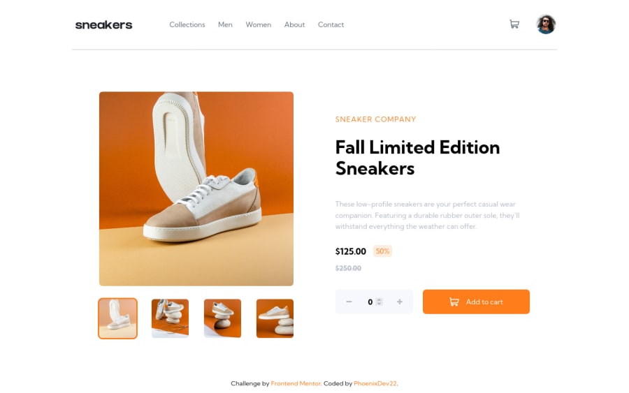
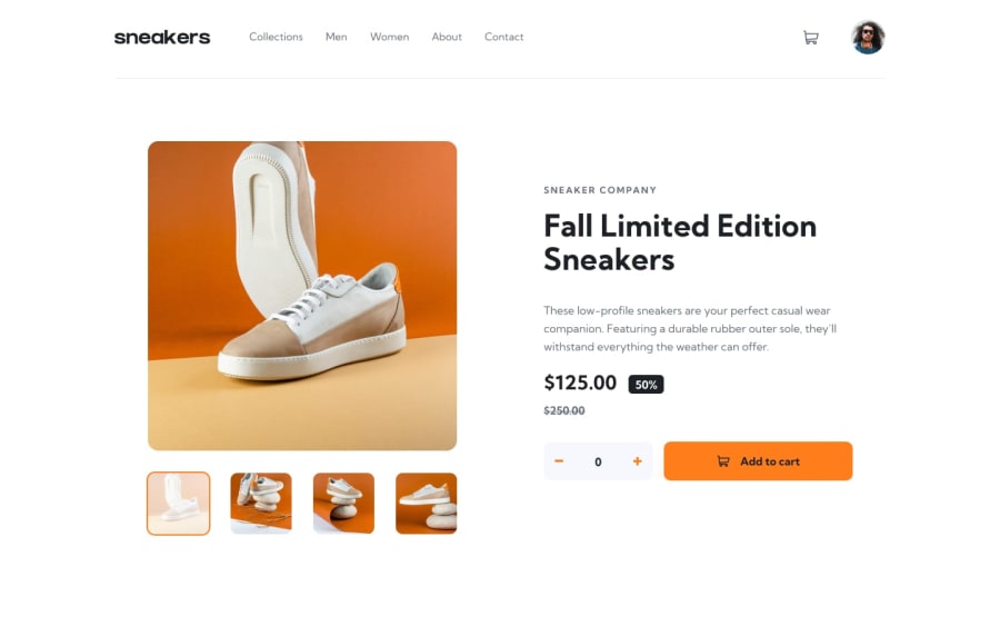
Design comparison
Solution retrospective
Hello community , This my second attempt doing this challenge. As I wasn't happy about how I did this project before. I started doing it from scratch. I had learnt a lot. I had a challenging time with making the shopping cart inner Html using JavaScript . For me, It turned much better from the first try. If you have any suggestions about best practices and any missing things please do leave a feedback. Thanks in advance.
Community feedback
- @devmor-jPosted about 3 years ago
Hey, great job on completing this challenge. This is a tough one and takes a moderate amount of time to reach perfection.
overall looks great and one thing I noticed with the cart logic is that user might manually enter a negative value in
inputelement. This logic could cause some problems in the back-end (store or payment system). I suggest maybe wrapping that section inside aformelement could be a good solution which enforce user to enter numbers above zero and prevents sending data without criteria met.Another thing which affects user experience is that hovering on navigation items (like men, about, ...) must exactly be on the text itself but it would be easier to select if hover effect appears just close enough.
To be precise I mean you could add padding directly on
ulinstead ofnav. I think convertingnavpadding style to margin would avoid css break due to refactor.Overall I really liked your solution and there are no critical issues in my opinion.
Keep it up and happy coding :) good luck!
Marked as helpful1@PhoenixDev22Posted about 3 years agoHello @devmor-j,
I really appreciate the effort you put into reviewing my solution and providing me with a such detailed feedback and explain things really well.
I haven’t noticed the negative value bug and What it can causes. I tried the number -3 and even in the cart the total would -375.00. I will absolutely fix it.
Thank you so much! I will try to implement your tips asap and will make sure to use them for all my futher projects as well.
Happy coding
1 - @K4UNGPosted about 3 years ago
Hey! It looks good! Great job on the challenge. I like the little popup that appears after clicking the checkout button. Here are a few things I noticed:
- When I add items to cart, instead of reseting the number of items, you should add onto the existing amount. Also when I add item with no amount selected, the modal becomes blank so you should also prevent users from adding 0 items if you decide to keep the current adding method without increasing the amount of items.
- When I delete the items, the amount indicator doesn't disappear. If I had two items in cart, even if I deleted them, the indicator is there still displaying 2.
- For the transitions, I think you should make them a little faster. It wouldn't matter too much here but, for bigger projects you should keep your transitions point on to not negatively affect the user experience. For me, I use somewhere around 200ms or less for general transitions.
- Lastly for the cart modal, instead of moving it from outer screen when clicked, you could move upwards just a little and accompany it with a fade animation. That way you can have a more natural loading animation.
Great work and Happy Coding!
Marked as helpful1@PhoenixDev22Posted about 3 years agoHello @K4UNG,
Thank you so much for taking your time and reviewing my code. I’m glad you liked it.
For the first suggestion, I didn’t get what you mean “ when I add item with no amount selected, the modal becomes blank ”. When the number of items is 0 , nothing is added.
For second point , the number of items indicator disappears when the add to cart clicked and delete icon as well as the checkout button. I just checked it now and it disappears. Maybe the type of browser used ??
For the last two suggestions , I’ll consider them for the future projects.
Thanks again .
1@K4UNGPosted about 3 years ago@PhoenixDev22 Normally it has a message in the modal saying "No items in cart" or something like that. But since it just updates the total items with the selected amount without adding onto it, I tried adding with 0 selected. When I did that, the bottom part of the modal, where all you items and the empty message were, disappeared, leaving only the top part with the title. I don't know if it's browser specific but I use Chrome.
Marked as helpful1@PhoenixDev22Posted about 3 years ago@K4UNG Thanks for clarifying the issue . I absolutely have a look again and see how this bug occur.
1
Please log in to post a comment
Log in with GitHubJoin our Discord community
Join thousands of Frontend Mentor community members taking the challenges, sharing resources, helping each other, and chatting about all things front-end!
Join our Discord
