Design comparison
Solution retrospective
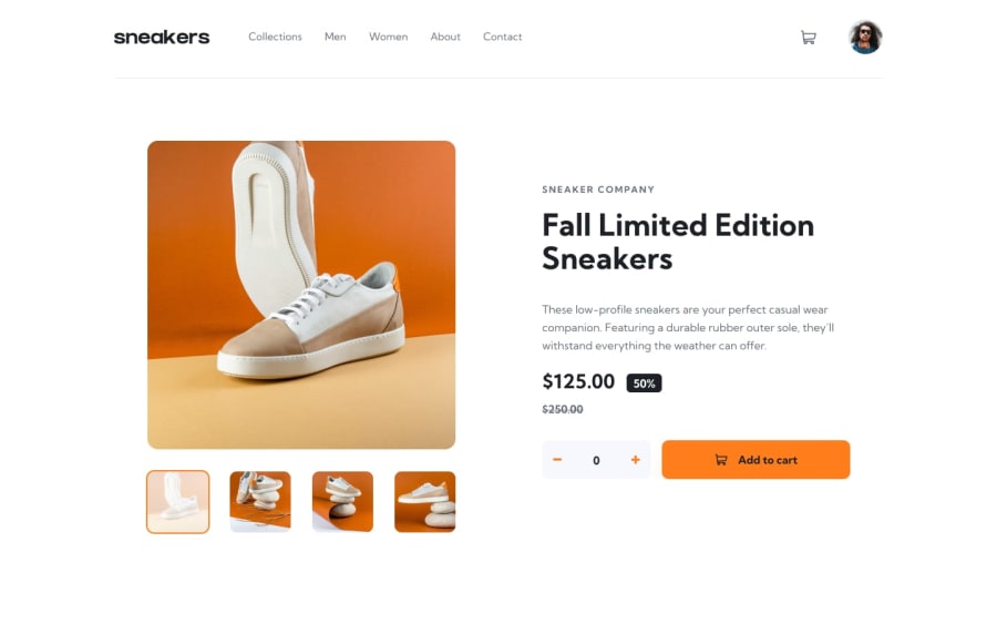
I was wondering if I should wrap the product images inside <button></button> tags since they are interactive elements activated by a user? I felt a little overwhelmed by this project in the beginning,. Although, I am quite happy with the end result.
Community feedback
- @fananibananiPosted about 2 years ago
Hi there! Your solution looks great!
I'm not sure whether wrapping the product images inside <button></button> tags would work, I don't really have advice on this. I did go through the page with Narrator, and while it could find the alt text, I couldn't tab through the images at all. If you include alt text for product images, I'd say a more descriptive alt text would be better, but perhaps others think differently.
I can't really say much about your code as I'm only starting to learn React now. But for accessibility, I see that the plus and minus buttons don't have any text that screen readers could pick up, so people using them have no idea what the buttons do. You could improve this in many ways, with an img alt text, a button aria-label or text inside the button that is visibly hidden. If you don't want screen readers to pick up on an image (for example an SVG), you can just add alt="" to it.
Hope this helps, let me know if you have questions about any of the above!
Marked as helpful0
Please log in to post a comment
Log in with GitHubJoin our Discord community
Join thousands of Frontend Mentor community members taking the challenges, sharing resources, helping each other, and chatting about all things front-end!
Join our Discord
