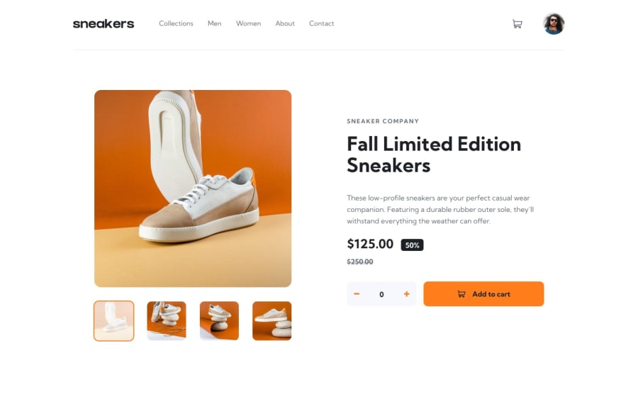
Design comparison
Solution retrospective
Hello eveyone ! This task is code for moblie view ,Please give your some suggestion for my coding skills and how to improve
Community feedback
- @Nam-HaiPosted almost 3 years ago
I won't go over all the things you could improve because honestly there is a lot.
You should try to pay as much as you can to details. Try to think ahead to produce the best experience for the user.
For now, I would suggest you to focus a lot on Flexbox. You use them but not at its full potential. try : https://flexboxfroggy.com to improve yourself.
For exemple, the margin on the 250$ is unecessary and a not responsive way to implement things. You should have put in the same container 125$ and -50% and in an other container the 250$, and give to the parent the property justify-content: space-between.
0 - @Ls6375Posted almost 3 years ago
Your code is not good cause you only designed this mobile always go for responsive apporoach.
Seems like you are completing these projects in hurry , I will suggest to take your time and code the design as it is given in the challenge.
0
Please log in to post a comment
Log in with GitHubJoin our Discord community
Join thousands of Frontend Mentor community members taking the challenges, sharing resources, helping each other, and chatting about all things front-end!
Join our Discord
