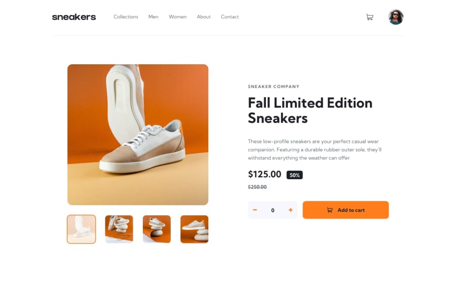
Design comparison
Solution retrospective
I don't know if I'm writing a good code all I know is my code is working. Please I will welcome any kind of feedback
Community feedback
- @yosefbrowncodePosted about 2 years ago
Hey,
Great job. I agree with Jhon. great in mobile and Desktop, but the in-between sizes need work. I would suggest trying to get the images to be able to change on mobile with the arrows like the original design and when the pop up is open the big image is missing. I know it is not easy, but it is worth the effort. You will learn a lot from building the project as close as possible to what was given. Keep up the good workMarked as helpful1@theegr8devPosted about 2 years ago@yosefbrowncode the pop up of the big image if you click the thumbnail is working now you can check but I don't know why is so slow responding. I will work on other sizes
0 - Account deleted
Your solution looks good in Mobile & Desktop layout but in a Tablet not good
For my recommendation
-
create a media queries for a tablet layout @media (min-width: 42.75em) {}
-
your JS file convert that file into Modular if ever you don't know how to used JS modules learned it because it will make your JavaScript file clean and easy to manage
1@theegr8devPosted about 2 years ago@okayda I will update soon and have not work with JS modules but i wil check that too thanks
0 -
Please log in to post a comment
Log in with GitHubJoin our Discord community
Join thousands of Frontend Mentor community members taking the challenges, sharing resources, helping each other, and chatting about all things front-end!
Join our Discord
