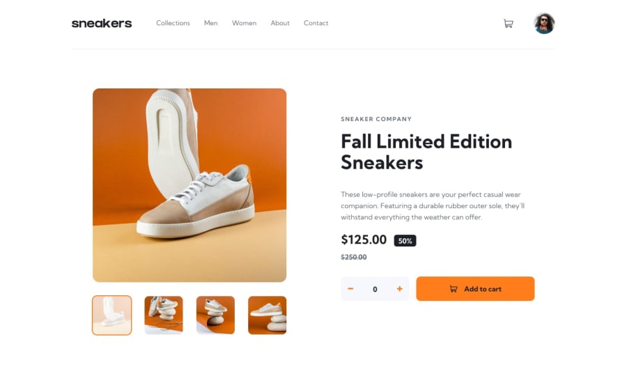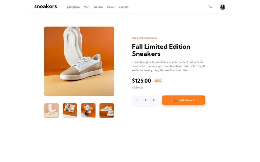
ecommerce-product-page
Design comparison
Solution retrospective
I hope this message finds you well! I recently completed this project and would greatly appreciate your feedback. Your insights and suggestions are valuable to me as I continue to improve my skills.
Community feedback
- @tatasadiPosted 10 months ago
Fantastic job on tackling this Frontend Mentor challenge! Your React application demonstrates a solid understanding of state management, component structuring, and responsive design principles. Here are some suggestions to enhance your project further:
Use REM for Sizing
Consider using
rem
units instead ofpx
for sizing elements. REM units are relative to the root element's font size, offering better scalability and accessibility. This change helps ensure your design adapts more fluidly across different user settings.Update State with Functional Updates
When updating state based on the previous state, use the functional update form
setState(prevState => prevState + 1)
instead ofsetState(state + 1)
. This approach guarantees you're working with the most current state value, especially important in cases where state updates may be batched or asynchronous.Why? React state updates are asynchronous. Using the current state directly inside
setState
might not always have the latest state value, leading to potential bugs, especially when state updates are rapid or depend on the previous state.Consolidate Image Slider Logic
It appears the logic for the image slider is repeated in both the Hero and Lightbox components. To streamline your code and adhere to the DRY (Don't Repeat Yourself) principle, consider encapsulating all slider-related logic (including navigation and image display) into a single reusable component. This new component can then be utilized wherever an image slider is needed within your application.
Creating a single
ImageSlider
component allows for:- Centralized management of the slider's state and behavior.
- Easier maintenance and updates to the slider logic.
- Reduced complexity and redundancy in your codebase.
You could pass the
images
array andcurrentIndex
as props to thisImageSlider
component, along with any handlers for next/previous navigation actions. This approach not only simplifies your application structure but also enhances the cohesion and reusability of your components.By focusing on encapsulating your image slider logic into one component, you streamline your application's architecture, making it cleaner and more maintainable.
Center Arrow Buttons Vertically in Tablet View
For better alignment of the arrow buttons in tablet view, ensure they're vertically centered relative to the image they accompany. You can achieve this with Flexbox utilities (
items-center
) or by adjusting their position with CSS to be in the exact middle, enhancing the user interface's consistency across views.Use Max-width Instead of Width
Rather than setting a fixed width like
w-[500px]
, usemax-width
to allow your content to be more fluid and adapt to the screen size while still maintaining a maximum width constraint. This approach improves responsiveness and ensures your content looks great across devices.Implementing these suggestions will not only refine your application's functionality and appearance but also enhance its maintainability and user experience. Keep up the excellent work!
Marked as helpful1
Please log in to post a comment
Log in with GitHubJoin our Discord community
Join thousands of Frontend Mentor community members taking the challenges, sharing resources, helping each other, and chatting about all things front-end!
Join our Discord