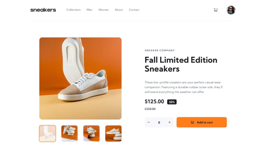
Design comparison
Solution retrospective
hi there! uh, this is my solution to the Frontend Mentor ecommerce product page challenge. I had a problem making the slider loop through the images and making the site responsive for tablets. a few other minor tweaks, I was also not able to code. feel free to look through my code: constructive criticism is welcomed. thank you!
Community feedback
- @DavidMorgadePosted over 2 years ago
Hello Chief, congrats on finishing the challenge!
I'm trying to test the logic of your App but seems that your cart button and the add to cart along the + and - buttons are not working, maybe try to add that functionallity to your JS! it will be fun I promise!.
Also try making every button clicable, it can make a better user experience that the user knows where he can click or not!
If your tablet layout is a bit broke, you can try keeping your mobile until desktop sizes, maybe is not the best solution but at least is a temporal fix!
Hope my feedback helps you, if you have any question don't hesitate to ask!
Marked as helpful0
Please log in to post a comment
Log in with GitHubJoin our Discord community
Join thousands of Frontend Mentor community members taking the challenges, sharing resources, helping each other, and chatting about all things front-end!
Join our Discord
