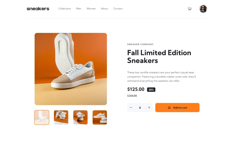
Design comparison
Solution retrospective
Any feedback would be appreciated, thanks :)
Community feedback
- @ghostribPosted about 2 years ago
Hey nice work! I think it looks pretty good. A couple thoughts:
When the mobile menu is open, tabbing through the elements closes the menu when tabbing away from the last item in the menu or tabbing backwards from the first item in the menu. Typically you want it to cycle back through the items in the menu. So it seems like your focus trap isn't quite trapping focus. I've used
focus-trap-reactmyself and had varying degrees of success. As an alternative, you might look into@reach/dialog. The documentation is quite a bit better in my opinion and has a bunch of workable examples. Either way works though.Accessibility is difficult and I'm still learning a bunch about it myself. Heres's a link about accessibility in modals
w3.org is good reference when dealing with these kinds of challenges.
Hope that helps!
Marked as helpful0
Please log in to post a comment
Log in with GitHubJoin our Discord community
Join thousands of Frontend Mentor community members taking the challenges, sharing resources, helping each other, and chatting about all things front-end!
Join our Discord
