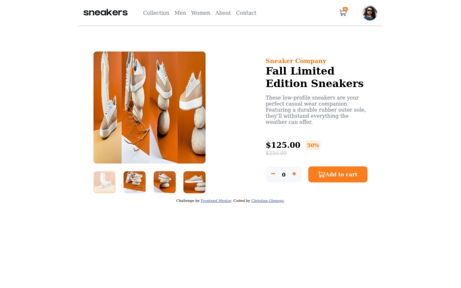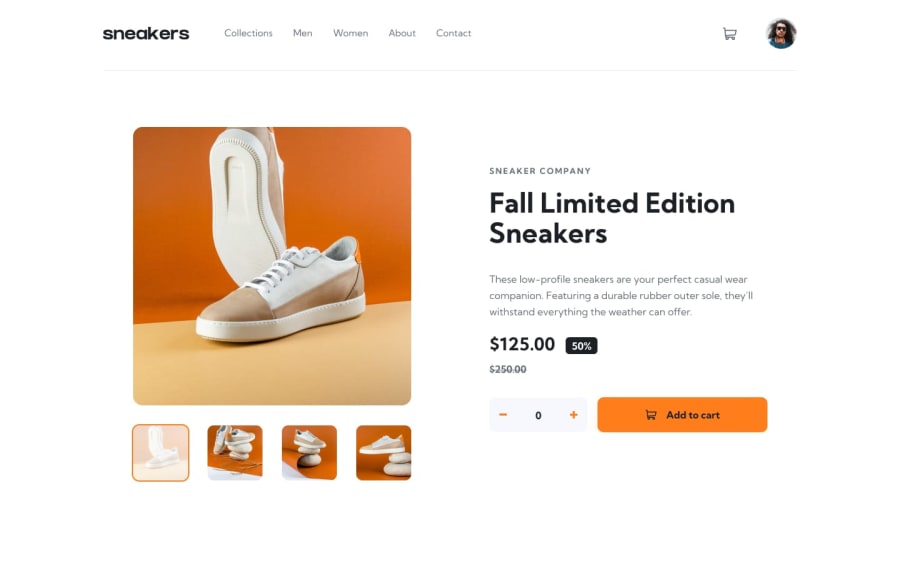
Ecommerce using Vanilla JavaScript and SCSS
Design comparison
Solution retrospective
Hi Everyone, I'm very happy solving this challenge but it took me awhile to finish. I had been experience imposter syndrome this last few weeks. I procrastinate a lot but here I am now getting better. I tried my best to come up with a better data structure in the JavaScript code but it seems like I need more practice and time to figure out everything. So I would be happy if you have something to comment or suggest specially on the JavaScript side and also for the CSS part. Thank You
Community feedback
- @eleswastakenPosted almost 3 years ago
Everything has to be interactive or you will make some people sad :(.
You see, when you try to navigate your page with keyboard(e.g. using tab), the only thing you can do is to leave your page because you can't order or look at the product. All this could be done using buttons and other interactive elements. So every time you think about scripting some elements, think whether that element actually is interactive; think of it this way, if you want to do something with a certain element, you probably should be using buttons or something...
Another thing, on mobile devices when you open the menu(menu should also be a button), there is an awkward animation of the entire container sliding in. You could do it this way, make the active state of a container fade-in and the nav slide in.
Best of luck!
Marked as helpful0@CHRISTIANGLENOGOPosted almost 3 years ago@eleswastaken you mean every element that is clickable it should be button element right ? Will take note all your comment for the future projects. I will also make some changes for more interactive and responsive design. As of the moment I still working to make it smooth. I also look your code and I'm impressed. Will also try the same approach as yours in solving this ecommerce. I really learned something you. Thank you for your comment I appreciate it very much.
P.s. I'll make sure that next time I will not make some people sad :)
0 - @byronbyronPosted almost 3 years ago
Looks like the font needs a little bit of attention in the CSS.
@import url('https://fonts.googleapis.com/css2?family=Kumbh+Sans:wght@400;700&display=swap');

body {
  font-family: "Kumbh Sans", sans-serif;
}
:thumbs_up:
Marked as helpful0
Please log in to post a comment
Log in with GitHubJoin our Discord community
Join thousands of Frontend Mentor community members taking the challenges, sharing resources, helping each other, and chatting about all things front-end!
Join our Discord
