E-commerce sneakers shop | Updated version
Design comparison
Solution retrospective
Hi There 👋
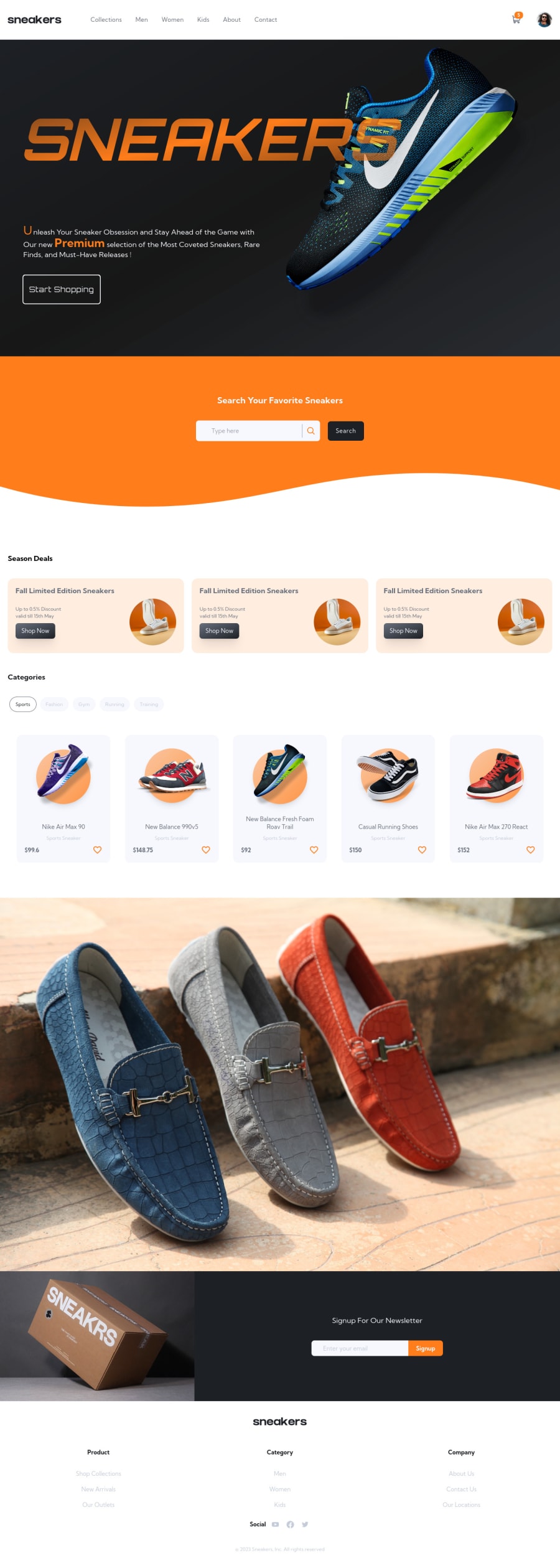
This is my second upload for this challenge, I just added new features to the application and I thought it might be a good idea to post these updates to hear your thoughts and listen to your valuable feedback 🤗.
update summary
- added the product's favorite logic (the ability to like and add a sneaker to the favorite list)
- the ability to search inside the favorite list by the product name.
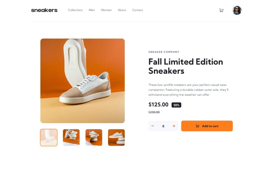
- added the order list logic and the order page to preview the order details after checkout.
- added the logic to track the user viewing history per product (for now it's just the main product so only one product can be added to the history).
- some minor styling changes.
- the app state is persisted over sessions locally.
that's all for now, please feel free to leave any feedback or suggestions that you might find helpful to the app, Thanks.
Please log in to post a comment
Log in with GitHubCommunity feedback
- @NermenElefky
Hi Ahmed 👋
You have done great work. The design is really good. But I think this professional website needs custom scrollbar. Above all, your efforts are greatly appreciated.
- @chukwudobe-Micah
Man, I must say your design is really good.👏🏾
Join our Discord community
Join thousands of Frontend Mentor community members taking the challenges, sharing resources, helping each other, and chatting about all things front-end!
Join our Discord
