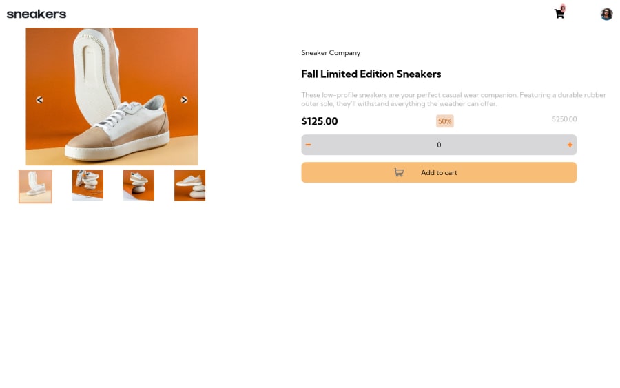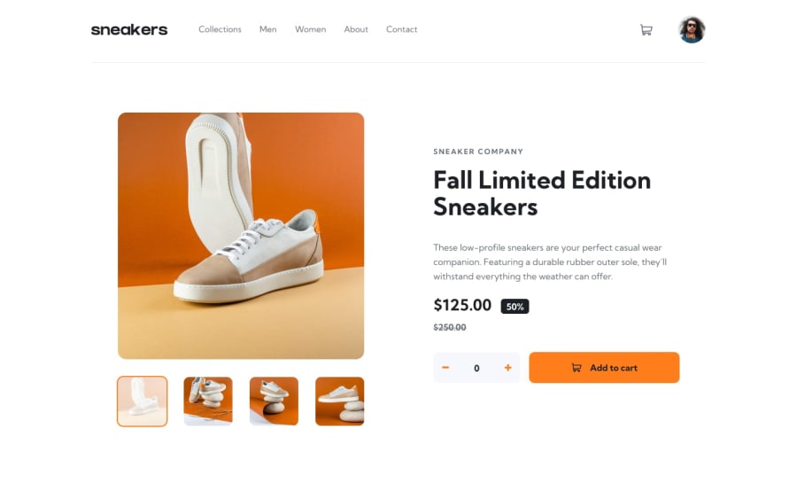
Design comparison
SolutionDesign
Solution retrospective
Hello, I mostly struggled with making the web responsive. This is my first responsive page. Please let me know how I did.
Community feedback
- @Aurelius77Posted over 2 years ago
Umm, giving your images alt text will solve some of your code issues. And you can maybe make the shoebox arrows a bit bigger hehe Looks awesome tho!!
Marked as helpful0
Please log in to post a comment
Log in with GitHubJoin our Discord community
Join thousands of Frontend Mentor community members taking the challenges, sharing resources, helping each other, and chatting about all things front-end!
Join our Discord
