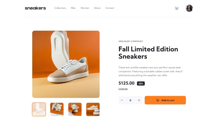
E-commerce product web page (html, css(Sass), pure JS
Design comparison
Solution retrospective
Hey world, This is my humble solution about E-commerce Product web page
I can not describe How fun it was anyhow I have some points I want you to help out
- I couldn't style the the think line that stays under the header with a gay color
- I suffered with the lightbox desktop but anyhow I did it and it works but I feel like there should another more effective way to get it done instead of just coding a lot I hope to look at my code
That's what I have so far I'm looking for your great ideas and suggestions
Thanks a lot for your time
Community feedback
- @DavidMorgadePosted over 2 years ago
Hello and congrats finishing this challenge!
To answer your question, you can get the bottom line using a
border-bottom: 1px solid grayin yourproduct-headerclass, I would also set thejustify-content: space-between, I think it fits a bit better than space-around. Or you can also create a pseudoelement with :after or a div with a heigth of 1 px to get a effect of a border-bottom, but I think that in this caseborder-bottomfits better.Hope my aswer helps you!
Marked as helpful1
Please log in to post a comment
Log in with GitHubJoin our Discord community
Join thousands of Frontend Mentor community members taking the challenges, sharing resources, helping each other, and chatting about all things front-end!
Join our Discord
