Submitted over 1 year ago
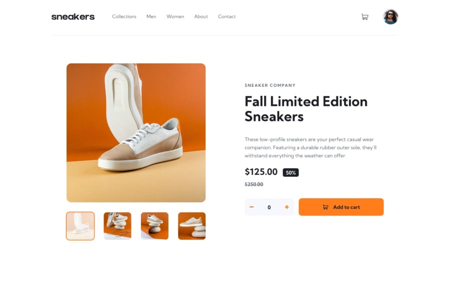
Ecommerce Product using NextJS & Tailwind
#next#react#tailwind-css
@Briuwu
Design comparison
SolutionDesign
Solution retrospective
Hello everyone! I'm Briuwu, with another challenge done! ヾ(≧▽≦*)o
It's been a while, but I’m back now! I took this opportunity to experiment with NextJS 13, and I was pleasantly surprised by how intuitive it was?! I think I’ll stick with NextJS for future projects, though I might face some difficulties when the challenge gets more complex haha.
This challenge was fairly straightforward, so I was able to finish it in a few days, but it was still enjoyable and stimulating to work on!
Thanks for checking this one out! ( •̀ ω •́ )✧
Community feedback
Please log in to post a comment
Log in with GitHubJoin our Discord community
Join thousands of Frontend Mentor community members taking the challenges, sharing resources, helping each other, and chatting about all things front-end!
Join our Discord
