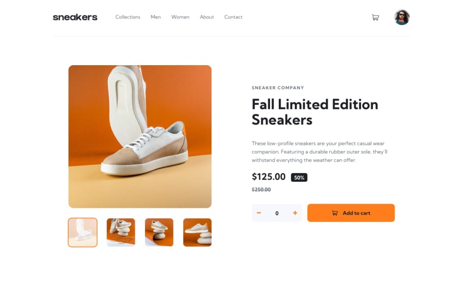
Design comparison
Solution retrospective
I've finished this around 7h work, its finally complete, but in mobile devices when i click the button <add to cart> the style of header changes into a desktop layout again misteriously, if anyone have an feedback i'm glad
Community feedback
- @RaidEyesPosted 12 months ago
There are many problems with your code:
-
You are using the desktop approach first which is not recommended, usually if we have the design for both desktop and mobile, we usually go with mobile first. You should only go for desktop first if the desktop design is all you have.
-
Regarding your
<header>, it seems that you didn't apply any style to the<ul>element. From what I see you change your components completely, this is not correct. You should apply the style to themenuwhen the screen size changes. -
Your
Reactcomponents render every time something is triggered which is not good for performance. Instead, when you click something only the related content re-render, this is also the point ofReact, using components to reduce complexity and increase performance.
Overall, still good work! Happy coding! Hope you find this helpful!
0 -
Please log in to post a comment
Log in with GitHubJoin our Discord community
Join thousands of Frontend Mentor community members taking the challenges, sharing resources, helping each other, and chatting about all things front-end!
Join our Discord
