Design comparison
SolutionDesign
Community feedback
- @khubaibulPosted almost 2 years ago
Hi! I have checked your project. You have done it very well. Although you can update some designs.
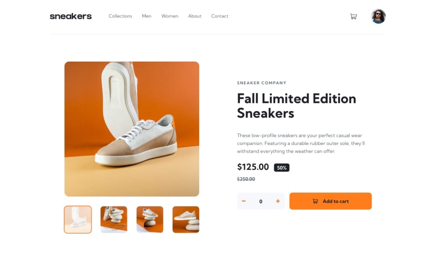
First, please try to align the main content to the centre from the left. Or you can take more space for images and text+button content. Try to give an outline or border in the navigation link based on active status.
There is one more issue that I have faced is, the number remains only one at the top of the shopping cart icon.
Have a good day.
Marked as helpful1@khubaibulPosted almost 2 years ago@jampiers You did very well. Keep it up.
0@Don-AlvinPosted almost 2 years ago@KIShakib Thank you very much for your review. I will work on the review. I really appreciate your review.
0
Please log in to post a comment
Log in with GitHubJoin our Discord community
Join thousands of Frontend Mentor community members taking the challenges, sharing resources, helping each other, and chatting about all things front-end!
Join our Discord
