Design comparison
Community feedback
- @Adrian-pyPosted over 2 years ago
Hi there! First of all, I really like your solution, there are several things that I really like about the solution but there are also things that I feel that can be improved.
Some of the things I really like:
-
The naming of the classes for each element is spot on. There is no over-complicated nesting on the naming of each class, instead, you named each element with the block name (the first class in the name) as the anchor. I really like it because it makes it easier for you to code your CSS or in this case SASS, without having any overcomplicated nesting on the SASS files, I really like it and would also follow it in the future.
-
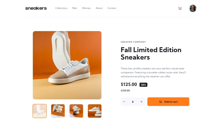
The smooth animation for the images. I love the smooth animations you have for the product images, especially the infinite image carousel on mobile screens and the lightbox for desktop screens.
-
The shopping cart logic. I like the fact that if you add the item twice, instead of treating it as two different products, it stacks it whilst also adding it and checking whether it has reached the max number of items. I really love the idea and good job on implementing the logic for this.
Some of the things that I feel can be improved:
-
Separation of the SASS files. I saw that for each file on each module/folder you import it one by one to the main.scss file. In my opinion, this is not a good way to structure your SASS files. Instead, maybe you can structure them more like so https://github.com/thecodercoder/fem-dklt-toggle/tree/main/app/scss, it provides separate central files for each module/folder and import them to the main.scss.
-
Some unresolved accessibility issues. I also noticed that there are some accessibility issues like not having alt tags on images and buttons not having texts inside of them. I would strongly suggest trying to resolve some of these issues. For the missing alt tags, I would say that alt tags are not necessary for <img> tags that are used for icons but are necessary for actual images.
-
Using @import instead of @use or @forwarrd for the SASS. It is better to use @use or @ forward for separating SASS files, as the SASS team discourages the use of @import. Here is a link in case you want to read more about how to implement @use and/or @forward.
Marked as helpful0 -
- @bugoaneoPosted over 2 years ago
My heartfelt thanks to you! I'll try to fix it on your advice and re-deploy as soon as possible. I heard about @use. Time to put it into practice! I'll check availability, too.
0
Please log in to post a comment
Log in with GitHubJoin our Discord community
Join thousands of Frontend Mentor community members taking the challenges, sharing resources, helping each other, and chatting about all things front-end!
Join our Discord
