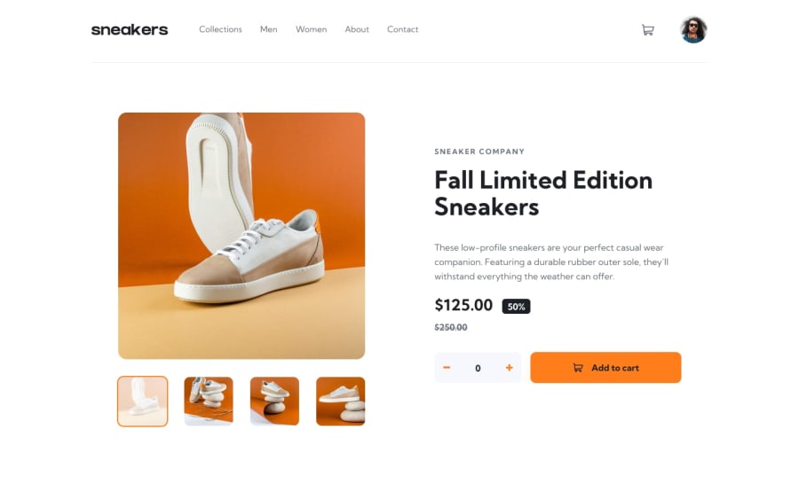
Design comparison
SolutionDesign
Solution retrospective
On the mobile screen, the previous button is displaying on the sidebar when it is active. How can I resolve that? Thanks, I await your feedbacks
Community feedback
- @Femi-BrightPosted over 2 years ago
Hi! Oluwakemi! Nice Attempts 👏. As regards the sidebar issue. I will suggest you add z-index to the sidebar to place it above the buttons
.wrapper .sidebar {
    z-index: 50;
}
I also noticed that the nav bounces whenever I hovered over a Link. You could correct that by this trick
header ul li.menus {
    border-bottom: 5px solid transparent;
}

header ul li.menus:hover {
    border-bottom-color: (255, 125, 26);
}
the bottom borders will always be there, so its not like they will be adding to the height of the nav each time you hover. I hope you find this helpful
Marked as helpful1
Please log in to post a comment
Log in with GitHubJoin our Discord community
Join thousands of Frontend Mentor community members taking the challenges, sharing resources, helping each other, and chatting about all things front-end!
Join our Discord
