Submitted almost 4 years agoA solution to the E-commerce product page challenge
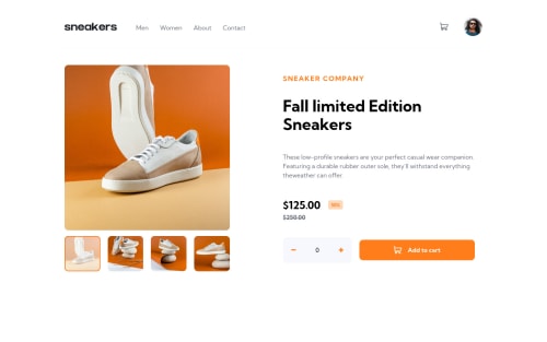
E-commerce product page with Vue 3 & SCSS
sass/scss, vue
@VaheAA

Solution retrospective
Very satisfied with this challenge as well as with result. Will appreciate any comments and advices.
Code
Loading...
Please log in to post a comment
Log in with GitHubCommunity feedback
No feedback yet. Be the first to give feedback on Vahe Abovyan's solution.
Join our Discord community
Join thousands of Frontend Mentor community members taking the challenges, sharing resources, helping each other, and chatting about all things front-end!
Join our Discord