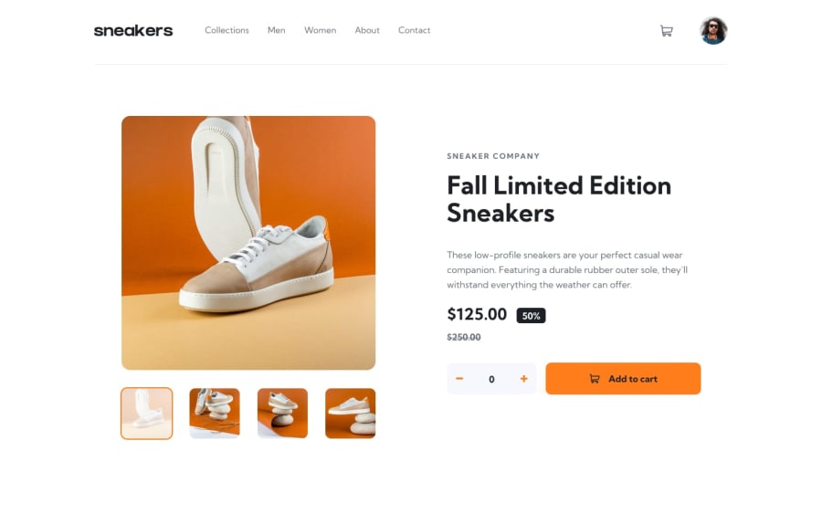
Design comparison
Solution retrospective
This was my first attempt at making a product page, so a lot of the different components are new to me and might not be the best. So if you have any feedback please leave a comment.
Community feedback
- @kartardeveloperPosted about 2 years ago
Hey Shikoto, nice work man! You did great. I mention some things that you missed and never good for the user experience -- 1). When you clear the cart you should remove the number from the cart also. 2). In your responsive design you hide product thumb images which are ok but if you show this user can directly jump to those images that he wants to see as you did on the desktop by just clicking on that image. I hope this will help you! Best of luck with your next challenge! 👍
Marked as helpful1
Please log in to post a comment
Log in with GitHubJoin our Discord community
Join thousands of Frontend Mentor community members taking the challenges, sharing resources, helping each other, and chatting about all things front-end!
Join our Discord
