Submitted almost 3 years ago
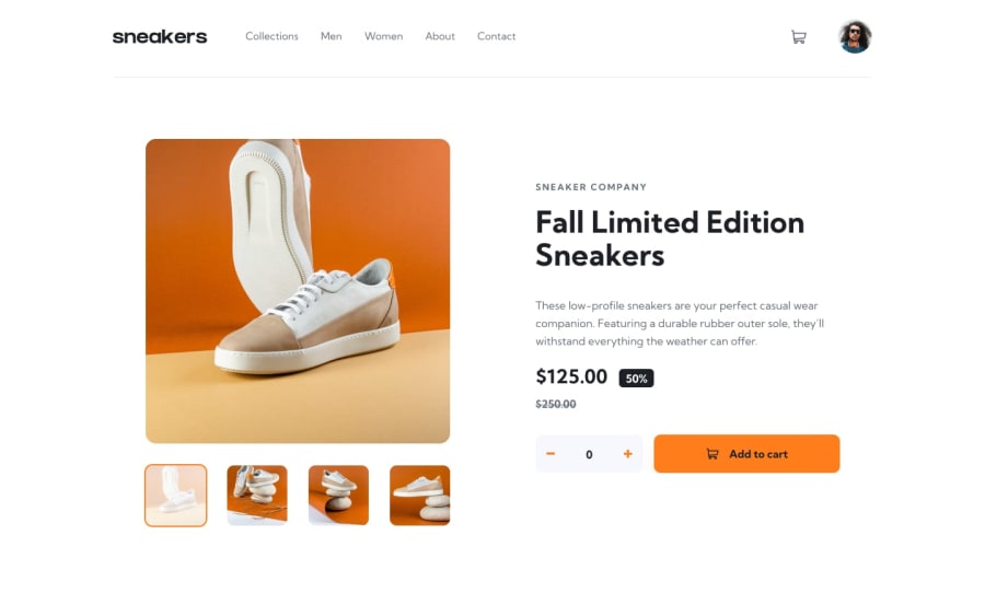
Ecommerce Product Page with Sass, BEM and Vanilla JS
#sass/scss#bem
@simplyJC
Design comparison
SolutionDesign
Solution retrospective
Any feedback will do to improve my code. I really appreciate it. Have a nice day. Thanks. :)
Community feedback
- @besttlookkPosted almost 3 years ago
Overall it looks good but wanted to give some suggestions:
- For small screen sidemenu should get close when clicking outside.
- After clicking "add to cart" quantity should reset to 0.
- Try add active state for the button to let user know button has been pressed.
- Add cursor:pointer for next and prev button , along with some hover effect.
- You navbar item color is blue. which does not look good with the design.
- Also, add hover effect on nav-items.
Here is my attempt: https://e-commerce-product-page-fem.herokuapp.com/
I am no expert , always happy to help if you need any. Good luck
Marked as helpful1@simplyJCPosted almost 3 years ago@besttlookk Thank you for the feedback . I am spending so much time to on JavaScript that I really missed that few details. I will give it a try.
1
Please log in to post a comment
Log in with GitHubJoin our Discord community
Join thousands of Frontend Mentor community members taking the challenges, sharing resources, helping each other, and chatting about all things front-end!
Join our Discord
