Submitted about 1 year ago
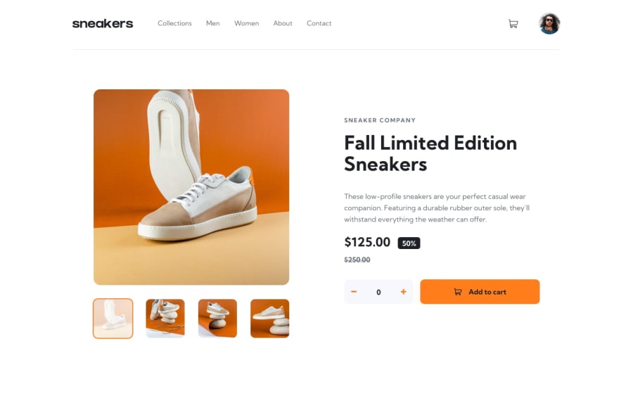
E-commerce product page with react and tailwind
@Imhandegbelo
Design comparison
SolutionDesign
Solution retrospective
This one was entirely fun for me. I made sure not to use any packages but to hardcode it all myself to build problem solving techniques and it was worth it. Kindly go through and make recommendations, suggestions and comment. Thank you
Community feedback
- @alex931dPosted about 1 year ago
hello great solution! however i have a few recommendations,
- fix design on larger screens: i have notice on largere screens the content slider don't scale good and end up looking slim and small with weird aspect ratios
- ability to exit modal on click outside: you should make user's able to click outside modals,
- structure your readme github file with the frontendmentor readme file
Marked as helpful0@ImhandegbeloPosted about 1 year ago@alex931d Thank you so much for your feedback. It is very much appreciated. I used percentage to style and totally forgot the large screens . Thanks again man. Kudos!
1
Please log in to post a comment
Log in with GitHubJoin our Discord community
Join thousands of Frontend Mentor community members taking the challenges, sharing resources, helping each other, and chatting about all things front-end!
Join our Discord
