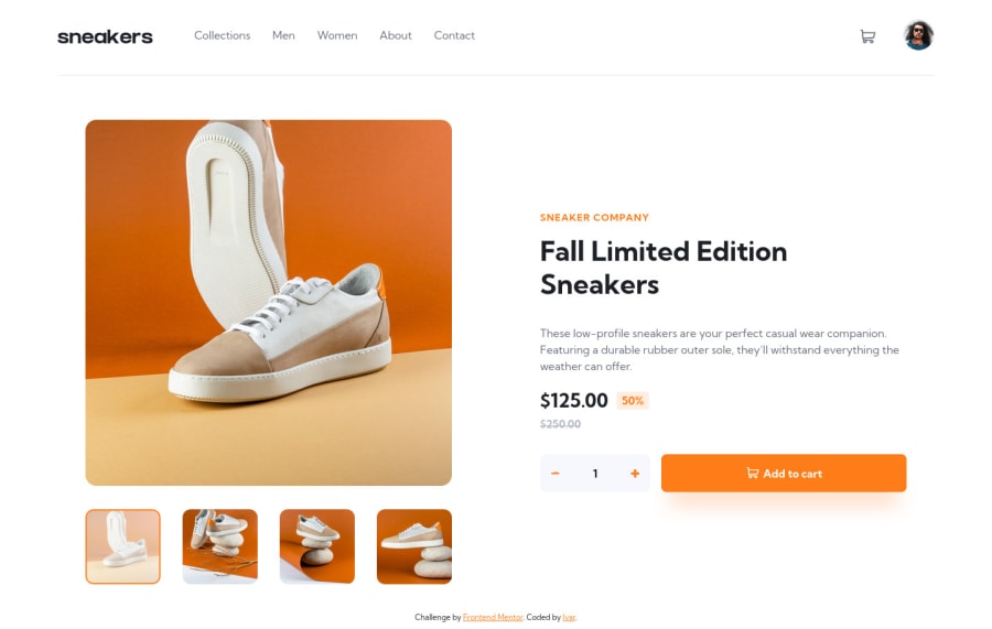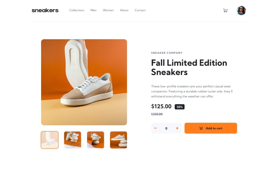
Design comparison
Solution retrospective
My first challenge delving a little deeper into JavaScript. I feel like my JS skills are lagging behind quite a bit compared to my HTML and CSS, so I am especially curious to find out what you think of the JS portion. Anything I could have simplified or taken a different/better approach to altogether?
Community feedback
- @sahand-masolehPosted about 2 years ago
Hi Ivar! Nice job!
Here are a few things I would fix:
- The lightbox modal doesn't have a close button. There's no way of closing it.
- Clicking on the thumbnails sometimes doesn't register.
- These many breakpoints seem a bit unnecessary to me. Your container element changes size based on the view port, you can set it to a flexbox or grid layout and have the children expand and shrink in a controlled manner.
- The minus button looks... weird..., at least on Firefox.
- You should put your JS in a separate file.
1@Ivar112Posted about 2 years ago@sahand-masoleh Thank you for your feedback! At first I was confused about your feedback on the close button, as there definitely is one, but then I realised that the close button was probably outside of the viewport. I used a hard pixel value to size my lightbox, which only worked for my big monitor. I fixed that now. The minus button does look weird. No sure when or how that happened. Thanks again!
0@sahand-masolehPosted about 2 years ago@Ivar112 Haha, yeah the modal is too big and it gets cut out at the top and bottom on 1920x1080. I zoomed out to 90% and it showed up.
0
Please log in to post a comment
Log in with GitHubJoin our Discord community
Join thousands of Frontend Mentor community members taking the challenges, sharing resources, helping each other, and chatting about all things front-end!
Join our Discord
