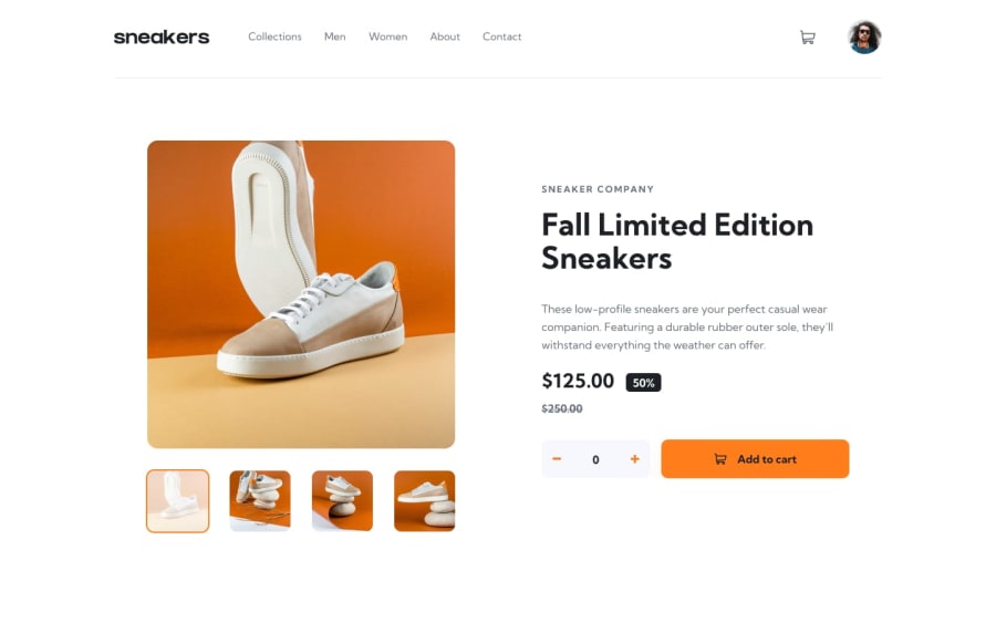
Design comparison
Solution retrospective
[ Problem solved ] -> [ Hi, I'm not done yet with the challenge because I got myself in a very troubling situation which I just can't find a solution for it: The cart-card always appears behind the h1 title of the sneakers or behind the horizontal line (hr) below the top-banner; I tried "skipping" the hr issue by just moving the cart-card away from the hr line, but still no idea how to solve the former issue. Searching on google/stackoverflow gives me just a bunch of threads (like "inner div before outer div"), I tried applying some of their solutions but still no progress.
Is the HTML code structure fine? Can a solution be achieved by not changing it in its entirety, i.e. by working only on CSS (or JS)? Thanks a lot! I hope to get over this annoying problem soon. I'll be working on the other parts of the website in the meanwhile. ]
Community feedback
- @rehberbeyPosted over 2 years ago
Hey man, nice work, but there are a few glaring things.
- You need to add a background to
div.cart-card, it's currently transparent. - The listener in
<div class="btn top-btn top-cart" onclick="cart()">...</div>is not working. - You should remove the following attributes from
div.attribution. Because they overlap.position: absolute; bottom: 15px; - There is a horizontal scroll bar on the home page of the site. It doesn't look nice.
- I haven't checked the code but it seems to be developed for desktop browsers only.
I like your work, I hope you will consider what I have said. 🎆
Marked as helpful1@yangxdevPosted over 2 years ago@rehberbey Hi, thanks for your helpful reply!
- Looks like I totally forgot about the div.cart-card's missing background, that's why any solution didn't work, with it being transparent.
- Being a work in progress, I've yet to code the cart() function, I was planning to start with it after fixing this issue.
- I'll take the div.attribution notice in mind!
- I noticed in previous projects that the scroll bar seems to appear only on Windows devices, I'm working on a Macbook's chrome browser (safari is the same) and the scroll bars are not there, I may need a heads-up for this thing too haha.
- Yeah, I started the website development for desktop browsers for now, planning to make the mobile side later when I'm done with the desktop design.
Thanks again!
1 - You need to add a background to
- @DavidMorgadePosted over 2 years ago
Hey man, sometimes this things just happens and we need a cold shower to find where is the damn bug I feel you.
The problem here is that you are not using any background color in your
cart-card, you are only usingbox-shadow: rgba(50, 50, 93, 0.25) 0px 50px 100px -20px, rgba(0, 0, 0, 0.3) 0px 30px 60px -30px;(and thats why it looks like the h1 is on top of the cart), set the background color of your cart-card to white and it will fix the problemTell me if it works, good luck!
Marked as helpful1@yangxdevPosted over 2 years ago@DavidMorgade Hello, thanks for the reply! I can't believe I missed the fact I didnt' add any background to start with! That's why nothing worked when I tried to fix the problem.
Thanks again!
0
Please log in to post a comment
Log in with GitHubJoin our Discord community
Join thousands of Frontend Mentor community members taking the challenges, sharing resources, helping each other, and chatting about all things front-end!
Join our Discord
