Design comparison
SolutionDesign
Solution retrospective
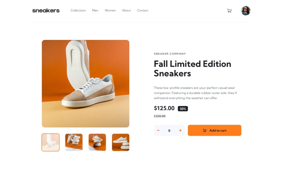
Hello everyone! Here is my solution E-commerce product page. Any feedback or suggestions are welcome. Thank you!
Community feedback
- @PaoloVilardiPosted over 1 year ago
Hi Zarko, congrats for your amazing solution! It seems pretty legit, you just need to adjust a few things to make it "pixel perfect":
- the border radius on the buttons to make'em round
- the text color on the navigation menu up top
- the changing color on hover on the icons of the lightbox. One last thing is the lightbox small images: you are changing the opacity while selected when you should apply a sort of white mask or filter on top. You can achieve it by using the pseudoelement
afterwithcontent: ''; position: absolute; top: 0; left: 0; width: 100%; height: 100%; background-color: var(--white); opacity: 0; transition: all 0.2s ease-in-out;and then when selected change opacity to the value you want (something like 0.7 would do the job). Hope this is helpful and congrats again for this great solution!!
Marked as helpful1
Please log in to post a comment
Log in with GitHubJoin our Discord community
Join thousands of Frontend Mentor community members taking the challenges, sharing resources, helping each other, and chatting about all things front-end!
Join our Discord
