
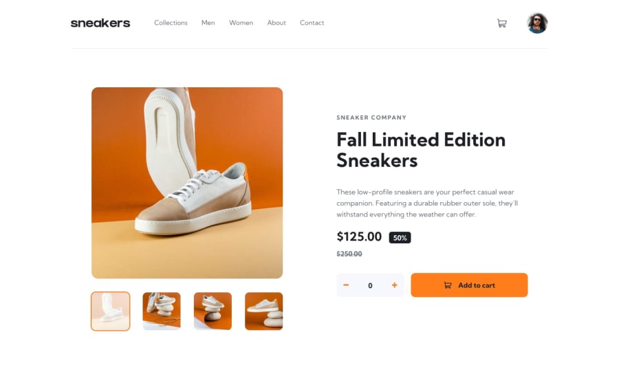
E-commerce Product Page Using TailwindCSS


Design comparison
Solution retrospective
So the website is finished on most of the desired screen size (responsive design). But there is one problem, it seems that when the website is being open at fullscreen browser, the content (including navbar and main content) will get stretched out to the side. On the other side, when its windowed, even on the max size of the screen it's not stretched out like before (this is what i want). A feedback or solution would be awesome about this issue, thank you in advance.
Community feedback
- @GitHub-dev12345Posted about 3 years ago
Nice Coding 🚀🚀👍 Congratulation to complete the challenge ❤️👍 My small suggestion : 1.In Card design CSS Code Used this:
transform : scale(0.8); this property decrease the size of card. 😉
large size for increase the number of scale & small size for decrease the number of scale
I hope you find this helpful
Marked as helpful0

Please log in to post a comment
Log in with GitHub
Join our Discord community
Join thousands of Frontend Mentor community members taking the challenges, sharing resources, helping each other, and chatting about all things front-end!
Join our Discord